Žvelk Giliau
- Paulius Budrikis
- Mykolas Saulytis
- Eglė Vitkutė
- Jonas Liugaila
- Živilė Mubarak
- Monika Repčytė
- Wide Wings
- Kernius Pauliukonis (PACKSHOT.LT)
Higienos Institutas
Healthcare
Visual identity, Strategy, Copywriting, Research, Branding
2023
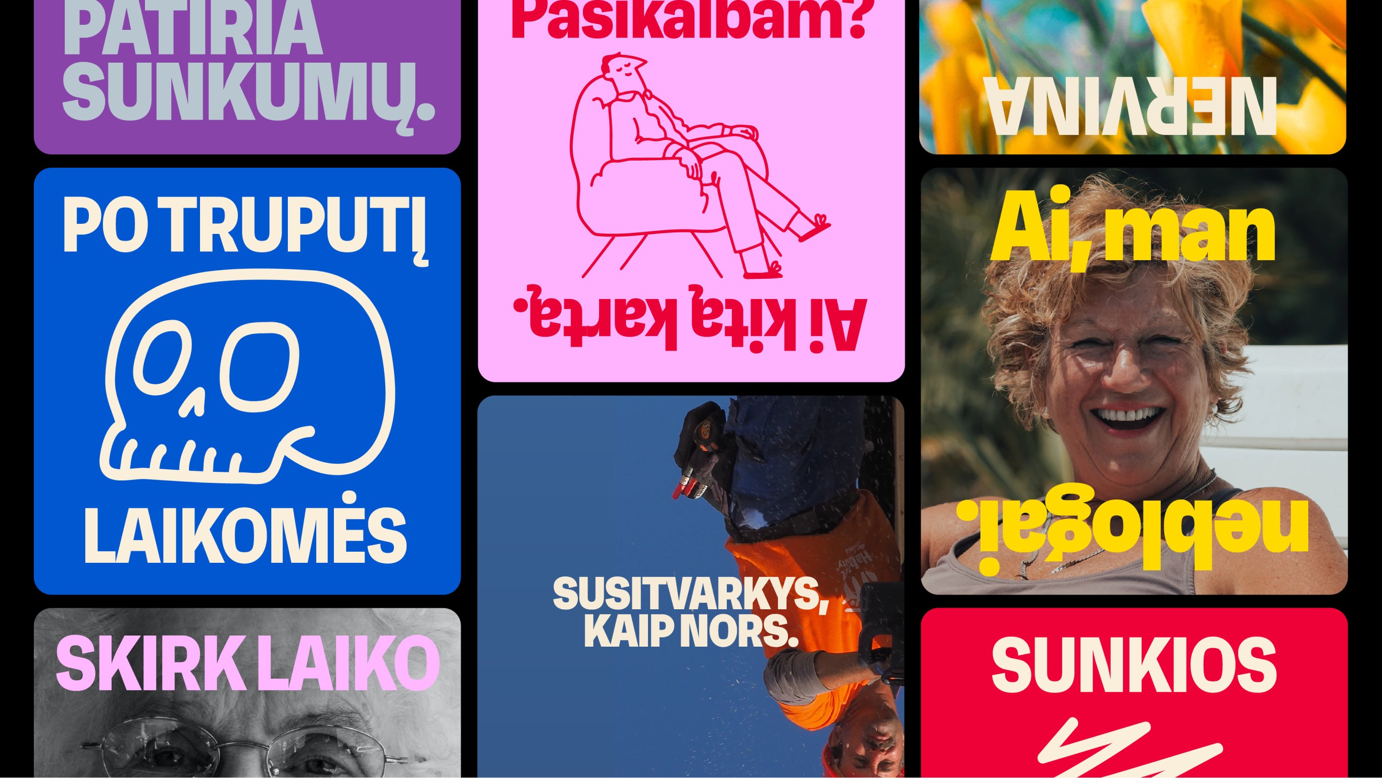
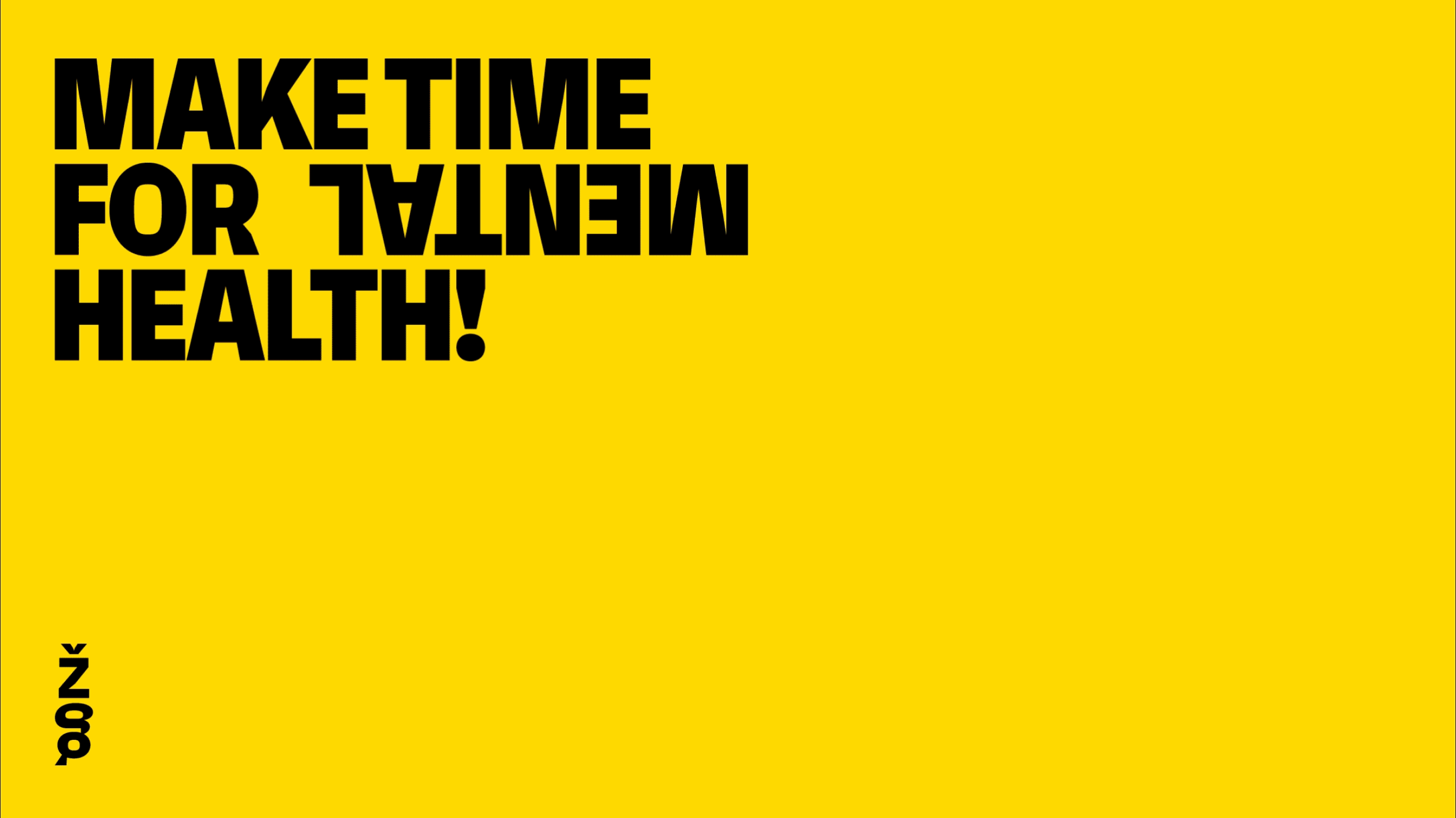
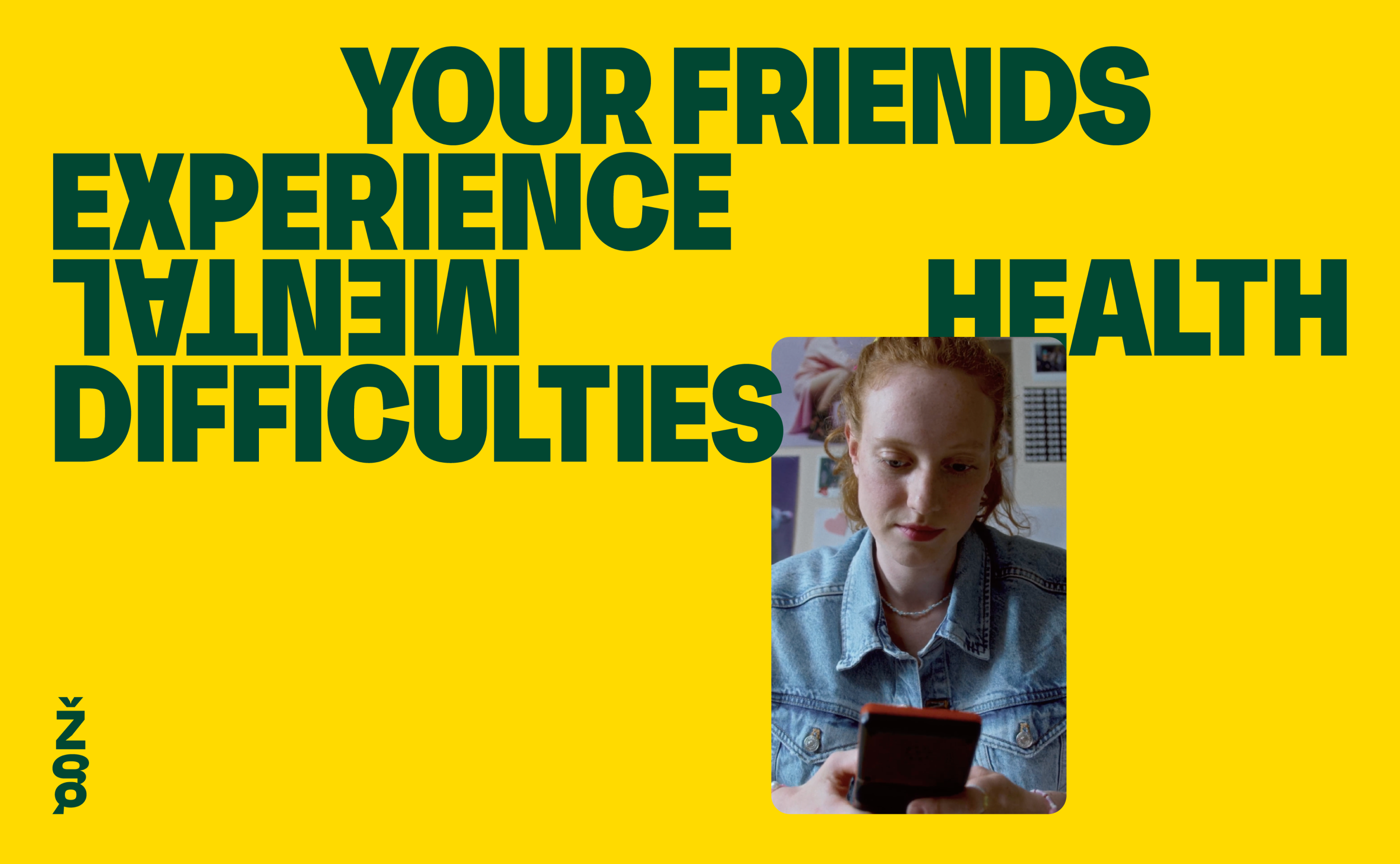
Mental health is the foundation of a person’s emotional well-being, making the ability to address it responsibly both an important and necessary skill. Žvelk Giliau (“Look Deeper”) aims to educate and foster a tolerant Lithuanian society, equipped with sufficient knowledge about the importance of mental health and its issues. This project is dedicated to changing attitudes and creating positive change in the field of mental health.
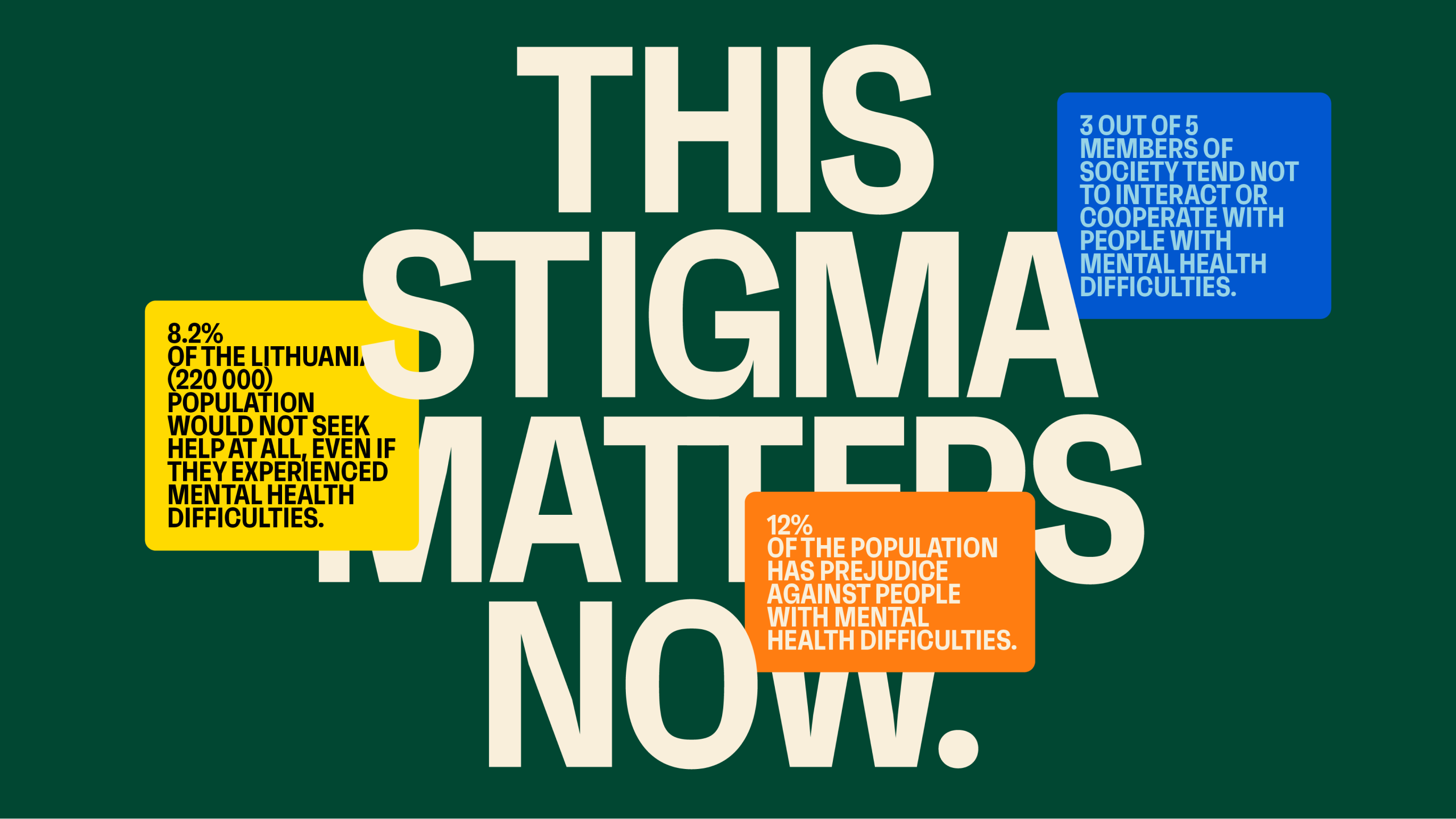
One of the project’s goals is to reduce negative public attitudes towards mental health from 61.7% to 56.7% by 2030.
Approach
Stakeholder Engagement
Research
Best Practice Analysis
Design Strategy
Visual Language
The Challenge
How can we transform the perception of psychological help?
The Context of the Challenge
There is a prevailing stigma surrounding the acceptance of psychological help. Many people choose to ignore their problems and avoid sharing their struggles, even when they are clearly visible. Psychological issues often go unrecognized until they reach a severe state. This unhealthy environment is prevalent not only in Lithuania but also globally. In response, the Hygiene Institute has focused on initiatives to shift public perspective on this matter.
The Insight
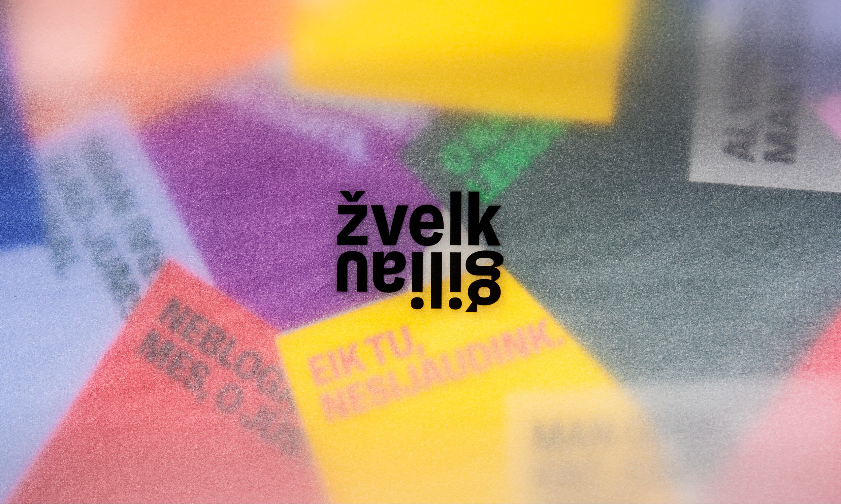
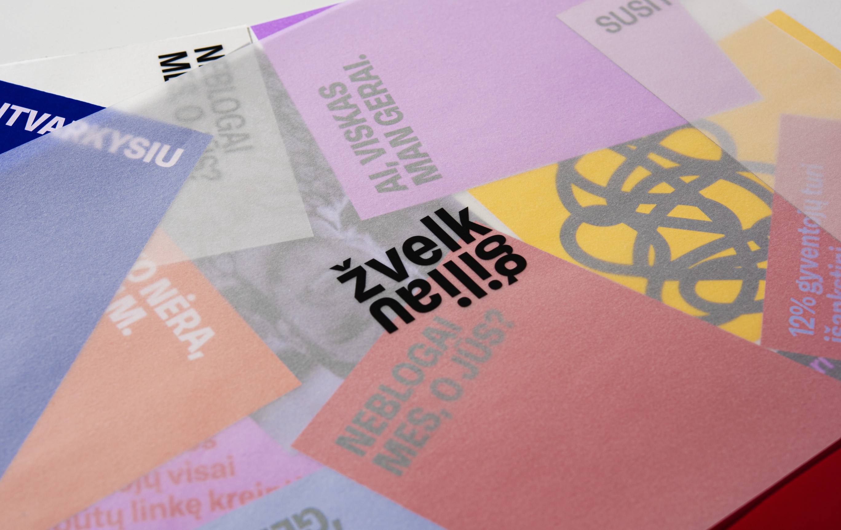
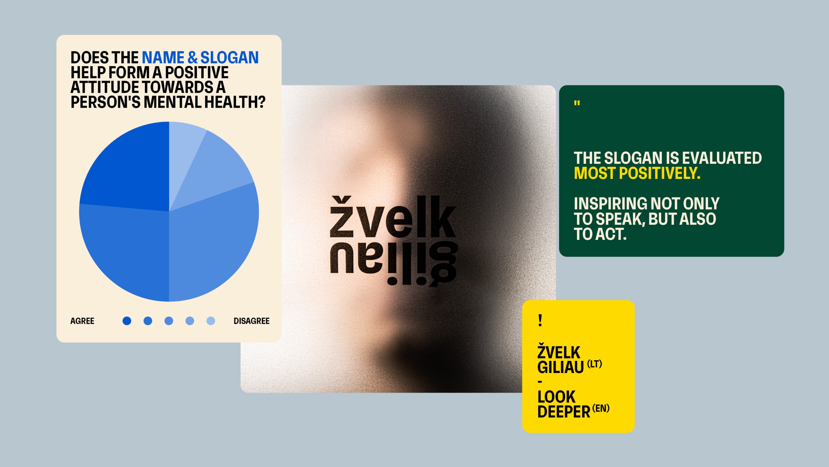
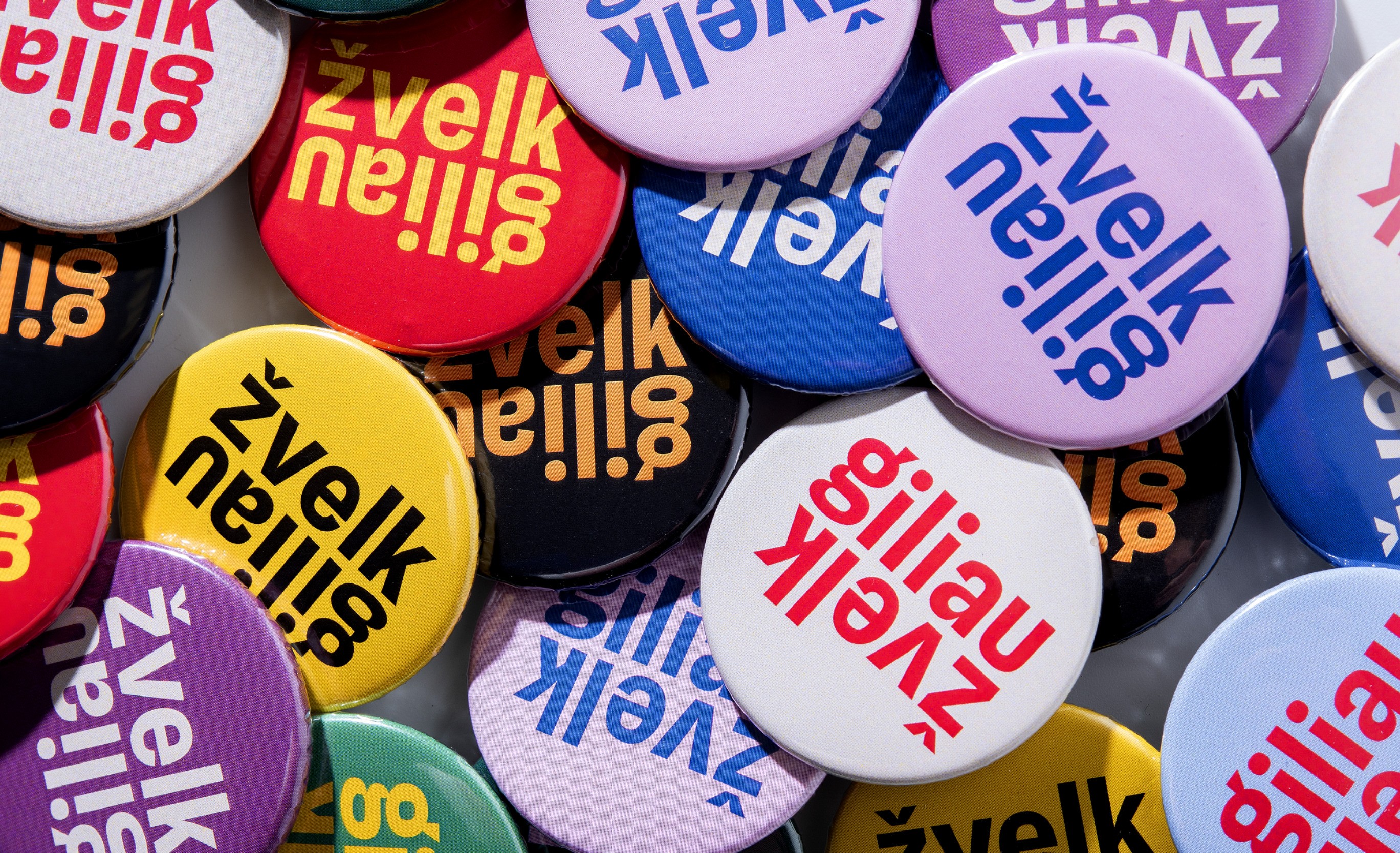
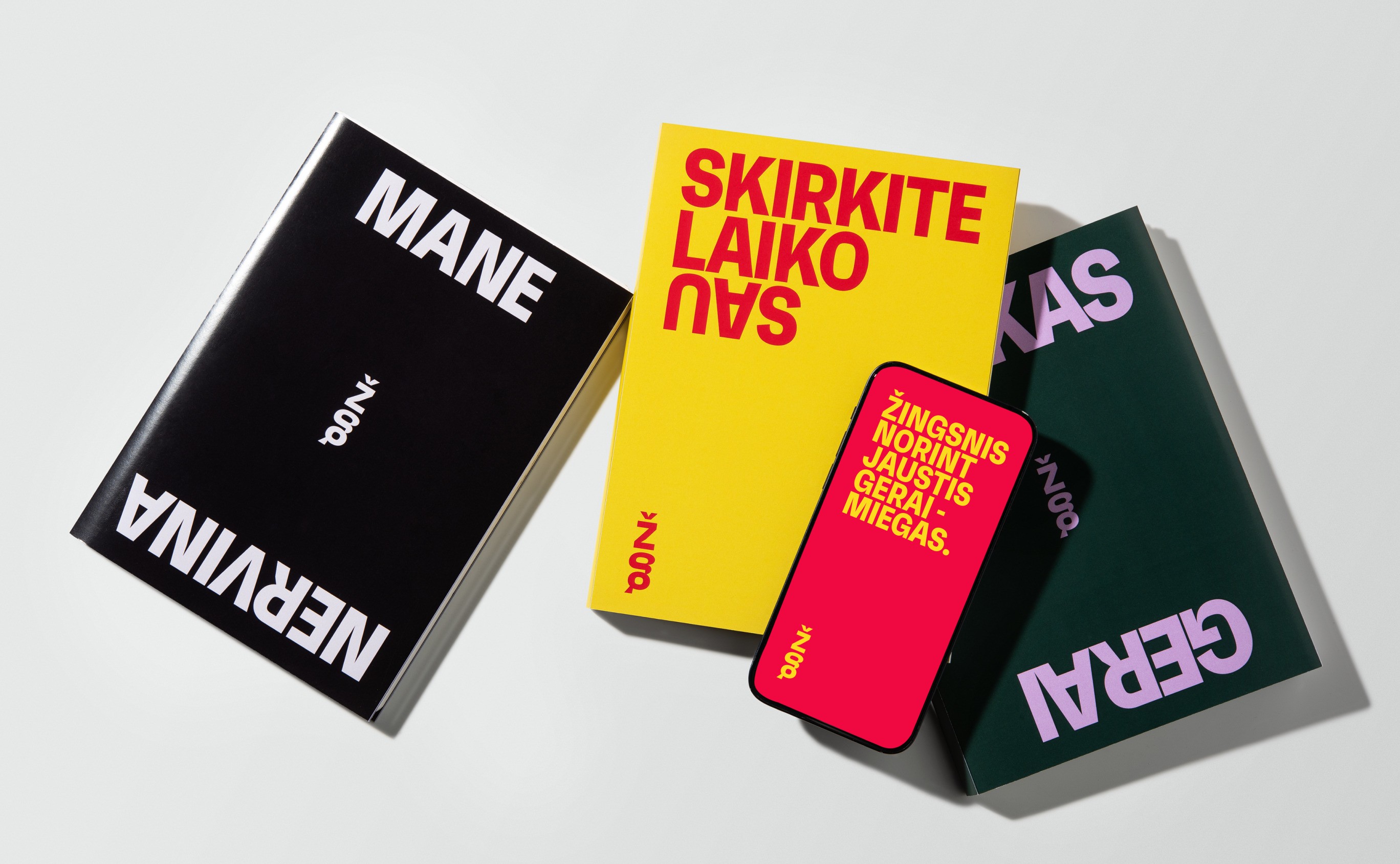
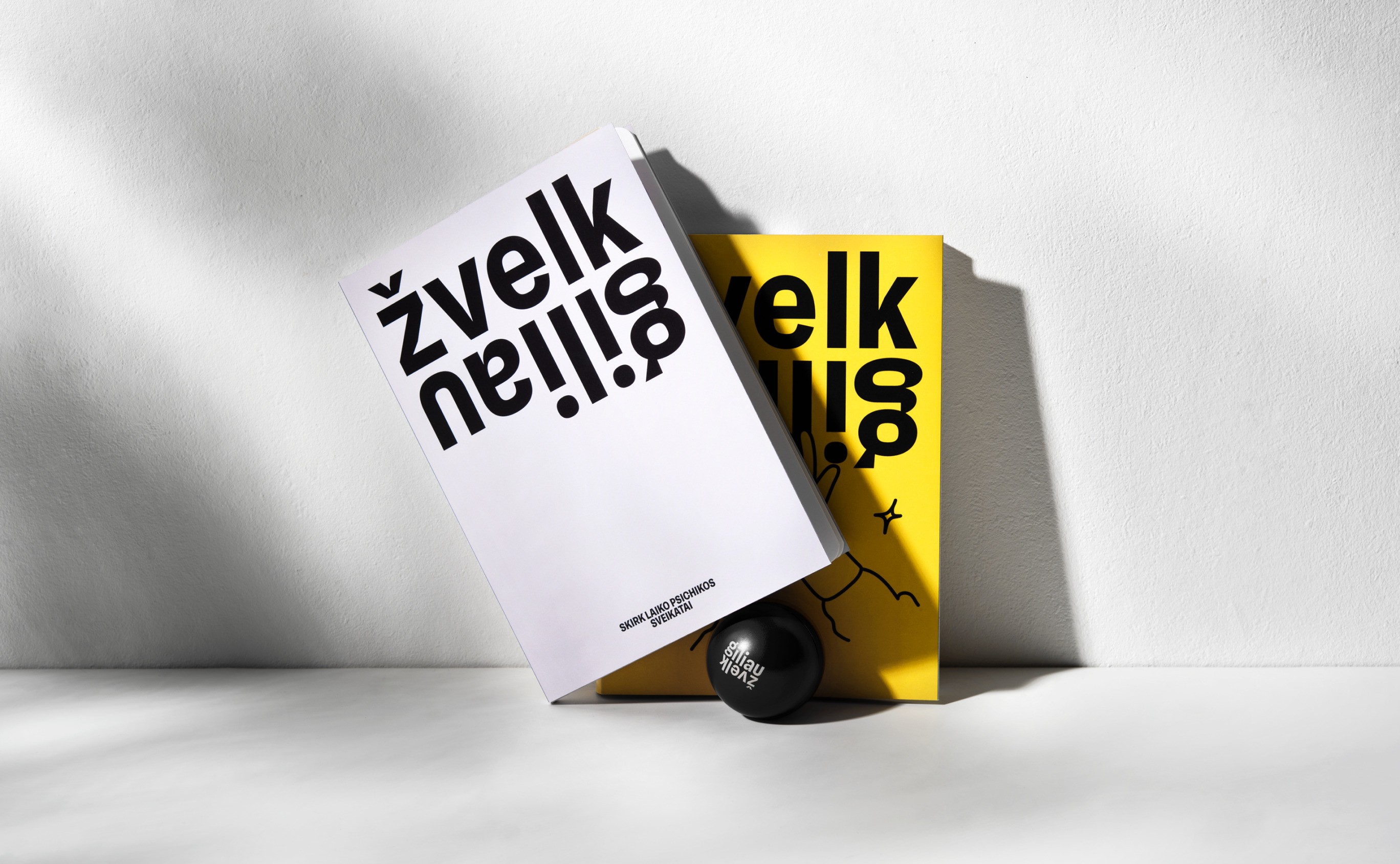
Not everything is as it seems. What’s visible on the outside can contradict what’s within. This question-as-a-contradiction became the guiding principle for the visual identity of Žvelk Giliau (“Look Deeper”), creating metaphors from inverted elements.
Visual Identity
The basis for these metaphors was tested through a research process involving the target audience, aiming to find delicate yet impactful solutions in this sensitive territory.
This principle extends to the logo as well. A broad color palette reflects the entire spectrum of emotions, while vibrant text and confidently used images allow for the creation of various situations in which individuals are encouraged to think and perhaps recognize themselves.


The Change to the Context
Reshaped Stereotypes: Created the direction to change long-present and sensitive perspectives. It has been achieved by adopting a subtle entry point and avoiding a didactic or preachy approach.
Challenged the Narrative: Introduced funny elements and vibrant colors to challenge the current perspective on how to speak about stigmas. Followed by the research insights, it formed more space for dialogue to appear.
Attracted a Broader Audience: Framing the visual message to enable the act of transformation and doing it in a positive expression invited more people to begin the journey or at least to ask the first question (which is an impact in itself).