Žalia Giria
- Paulius Budrikis
- Mykolas Saulytis
- Jonas Liugaila
- Martynas Bacvinka
- Jurgita Babilčiūtė
- Vidmantas Girskas
- Kernius Pauliukonis (PACKSHOT.LT)
Žalia giria
FMCG
Visual identity, Branding
2020
Žalia Giria (“Green Forest”) is one of the oldest water companies in Lithuania. Its underground spring water, with a unique chemical composition, is extracted from a 200 m deep well. This water has a calcium-magnesium hydrocarbonate composition, a pH of 7.7, and contains various other mineral substances. With widespread popularity, the brand aimed to elevate itself to a higher standard.
Approach
Contextual Analysis
Stakeholder Engagement
Competitor Analysis
Concept Creation
Visual Identity
Ecosystem of Means

The Challenge
How can Žalia Giria seamlessly rebrand into a different category?
The Context of the Challenge
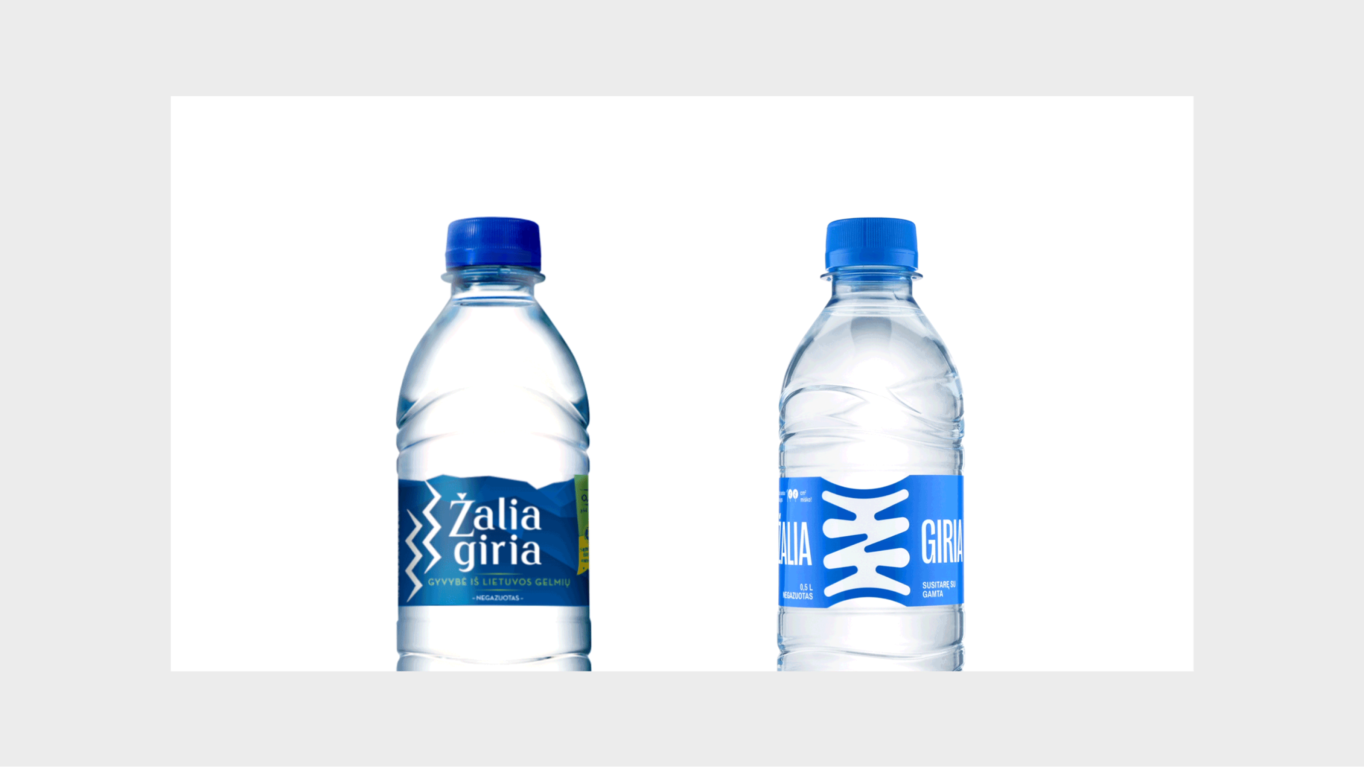
Žalia Giria has been very successful in the economy category, becoming a household name for extra-large water bottles. This success has made it challenging to introduce new products and expand the product line. The brand itself has been overshadowed by “the bottle,” making it difficult to communicate its various value elements.
The Insight
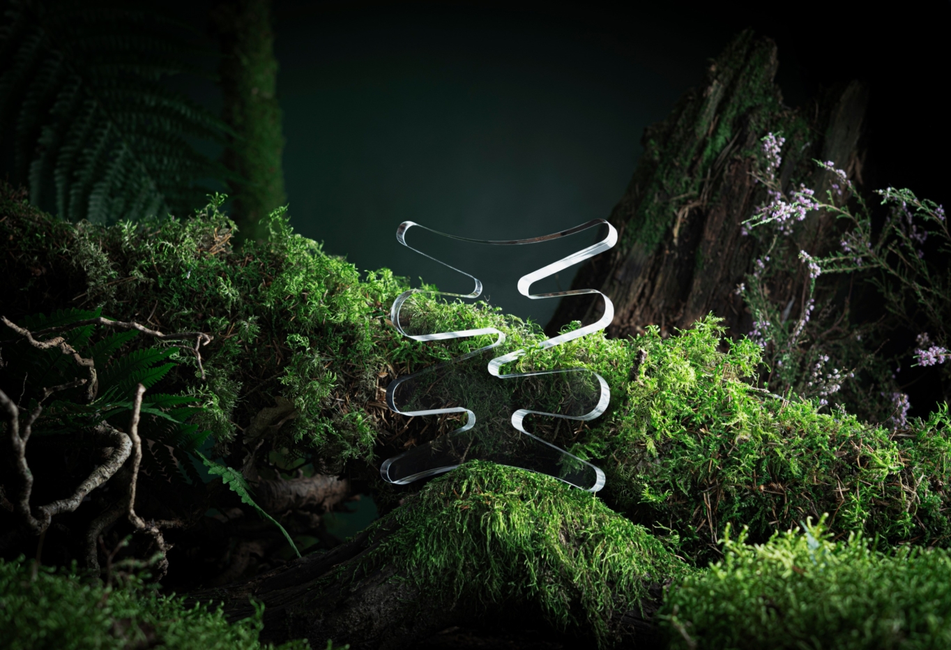
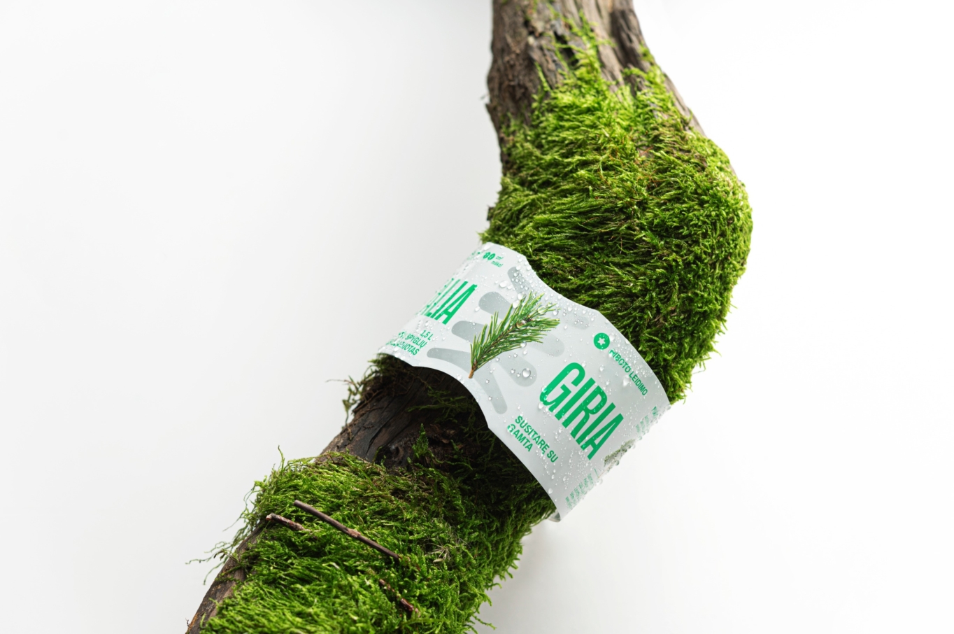
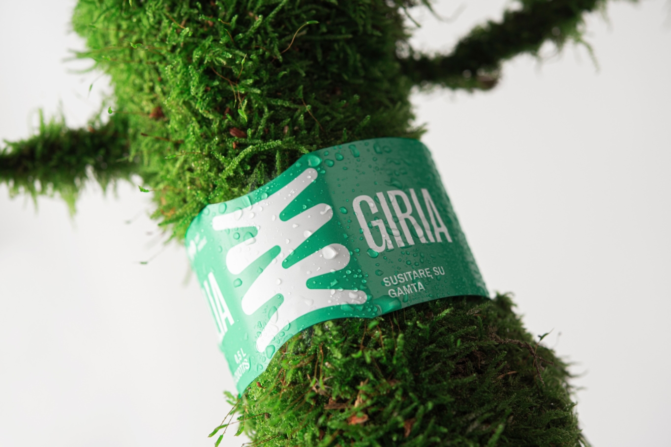
Being deeply integrated into people’s water-drinking experience, the brand itself becomes an integral brand-as-an-experience, connecting nature and humans, roots and branches. The letter “Ž” in the name symbolizes this connection, representing the agreement and bond between man and nature.
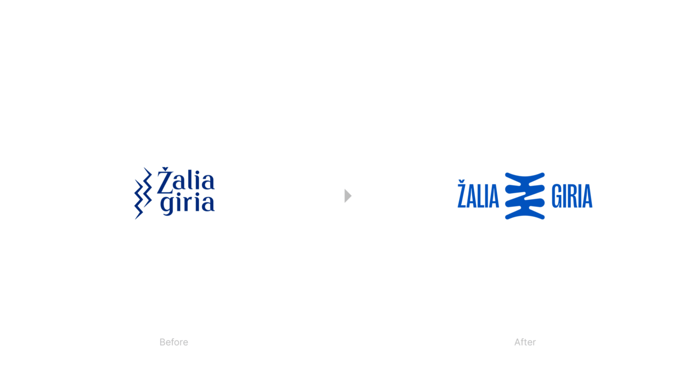
Logotype
The new “Žalia giria” logotype is the letter “Ž” with two check marks: one at the top and one at the bottom. The extra check mark indicates symmetry and balance. Balance between branches and roots, earth and sky, human and nature. The new letter “Ž” symbolizes “root-nourishing water,” where roots belong to both: forest and human. “Žalia giria” represents the agreement and connection between man and nature. How? The branches and roots interwine not only in the forest – the same happens in the life of humans.
While creating the logotype, we also looked at the roots of culture, especially the traditions of old ceramics. In ancient times, people decorated their everyday dishes with magic signs, thus fostering a connection with nature. The ambition for a new label was the same – to make it meaningful in terms of relationship with nature – just like in the old pottery.
Logotype
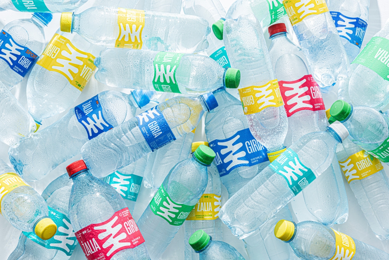
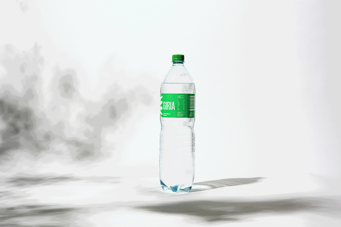
Introduced Into a Category: The new visual language allowed the brand to seamlessly enter different product categories.
Opened Up Perspectives: The engagement process revealed new opportunities for further growth.
Communicated Value: The research process identified key value elements that were successfully translated into the visual language. Now the brand can communicate value across different product lines.