Šiauliai District
- Paulius Budrikis
- Mykolas Saulytis
- Živilė Mubarak
- Jonas Liugaila
- Martynas Bacvinka
- Jurgita Babilčiūtė
- Miglė Lapienytė
Šiaulių district manicipality
Public
Visual identity, Copywriting, Sensemaking, Research, Engagement, Brand positioning
2023
The Šiauliai district has been an important meeting point for various cultures, transportation routes, tourism paths, and creative initiatives. However, it has always lacked a unified voice to convey its value and invite participation.
Approach
Desk Research: Conducted research on the place’s history, culture, and strategies.
Engagement Sessions: Collected qualitative and quantitative data from sessions with key stakeholders.
Data Sensemaking: Interpreted gathered information for brand positioning.
Brand Positioning: Developed the perspective for visual language and strategic guidelines.
Framing the Narrative: Created the idea and content for communication and did the copywriting.
Visual Conceptualization: Prepared visual concepts to identify entry points for stakeholder agreement.
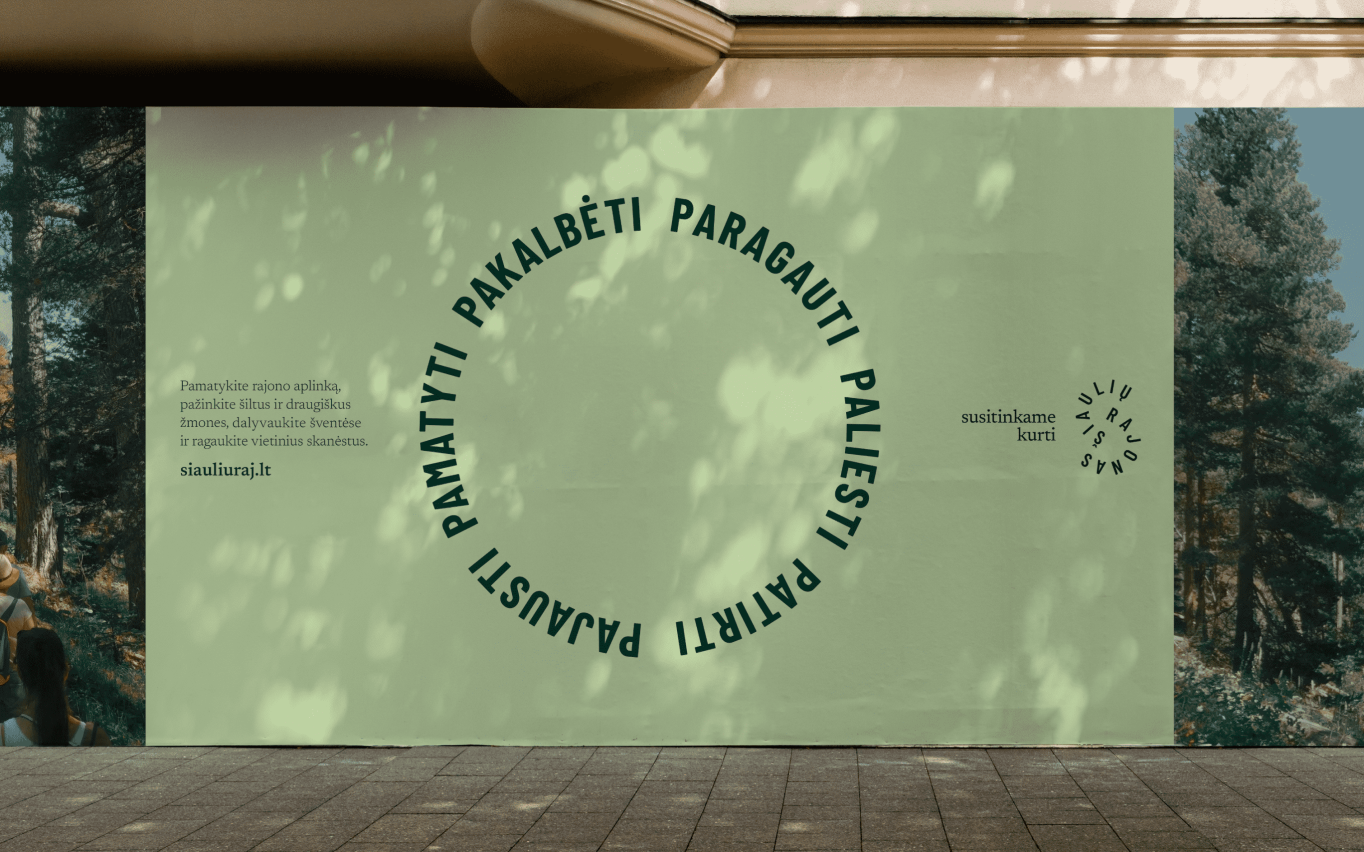
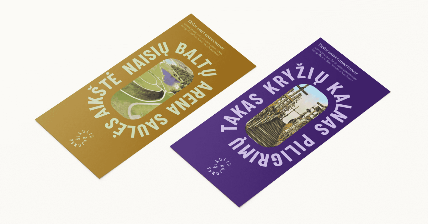
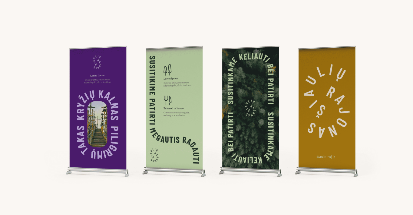
Visual Identity: Created a logo, graphic elements, and a comprehensive visual system for the district.
The Challenge
How to reveal what the district is about in an engaging manner?
The Context of the Challenge
The Šiauliai district has many potential pathways to express the value it provides to multiple audiences. Nevertheless, there needs to be a narrative that encapsulates all these elements and resonates with the identity of the place and its aspirations. How can this story be found and visualized?
The insight
The brand extends to various worlds and has multiple manifestation options. Combining a logo with a gesture connects a few of them and enables people to express the brand without any additional materials or brand elements.


Identity Signifiers
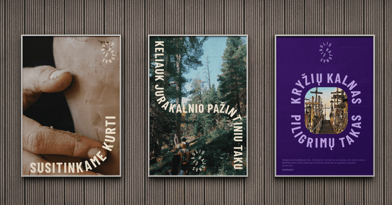
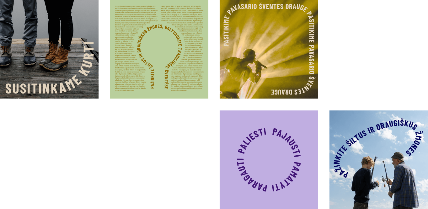
The visual language of the Šiauliai district expresses the moment of meeting and the creativity born from it. A genuine human encounter never follows a straight trajectory; it adapts and changes depending on whom it meets. Based on this principle, a logo was created, which itself is a symbol—two open half-circles facing each other. At the same time, they form a constantly evolving (open) circle. Additionally, each letter in the logo is significant in shaping and creating a harmonious whole. What is striking is how simple it is to depict the logo-symbol: the connection made by the fingers of both hands (see visual material). This way, the symbol comes alive in everyday life.


The change to the context
Unified Language: Stakeholders identified the district’s values, enabling constructive dialogue on strategy and further actions.
Uniqueness: The visual language created instant differentiation from other districts and cities.
National Recognition: The brand engaged multiple audiences and received great feedback nationwide.