Neringa Restaurant & Hotel
- Paulius Budrikis
- Mykolas Saulytis
- Jonas Liugaila
- Živilė Bugenytė
- Jokūbas Mažeika
- Paulius Budrikis
- Kernius Pauliukonis (PACKSHOT.LT)
Neringa
Hospitality
Visual identity, Branding
2020
Once deemed one of the best and most fashionable restaurants in the Soviet Union, Neringa Restaurant was famed for its exquisite food, bohemian atmosphere, and live music. It was a popular venue not only for renowned Lithuanian artists but also for celebrities from abroad.
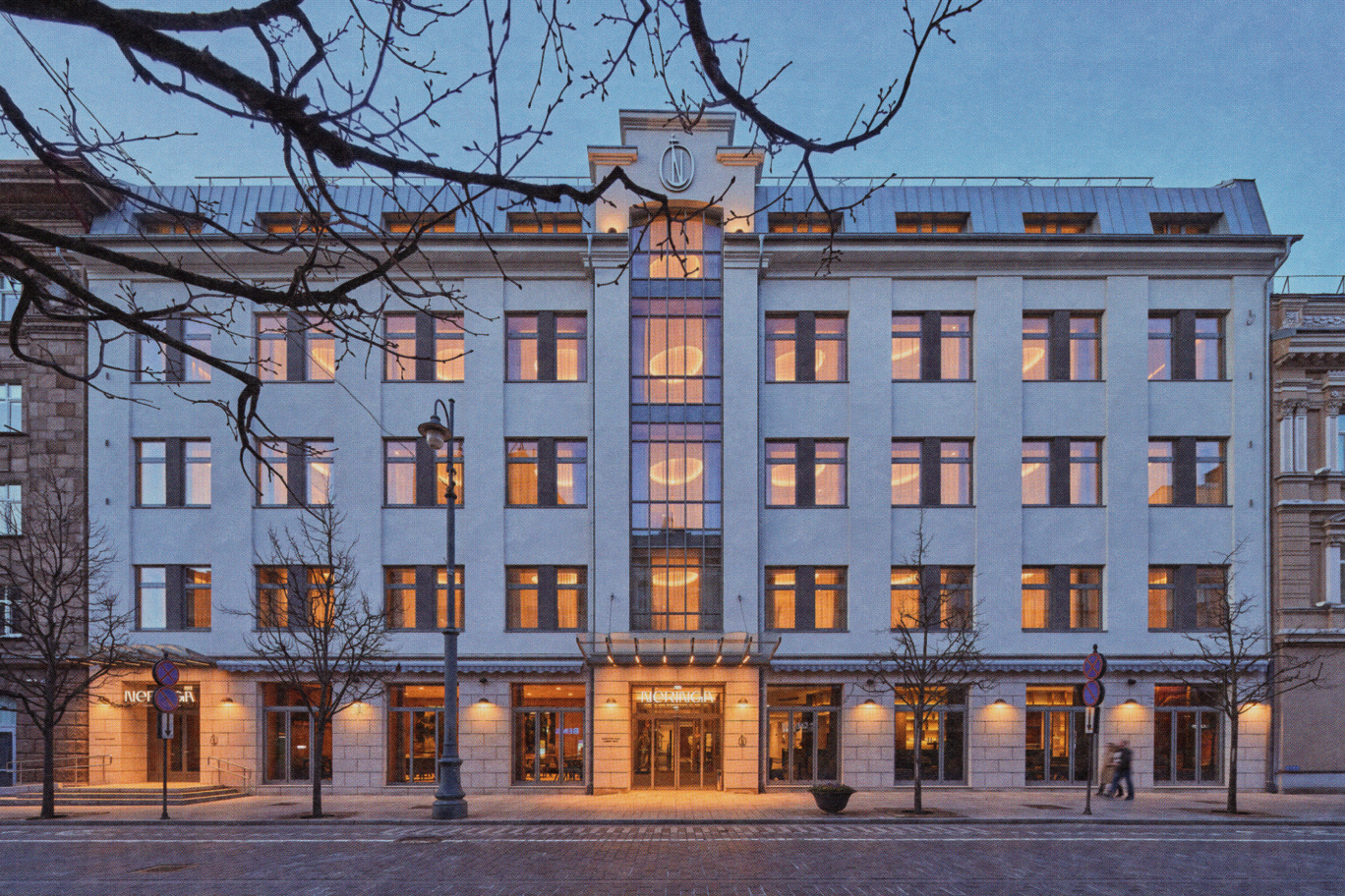
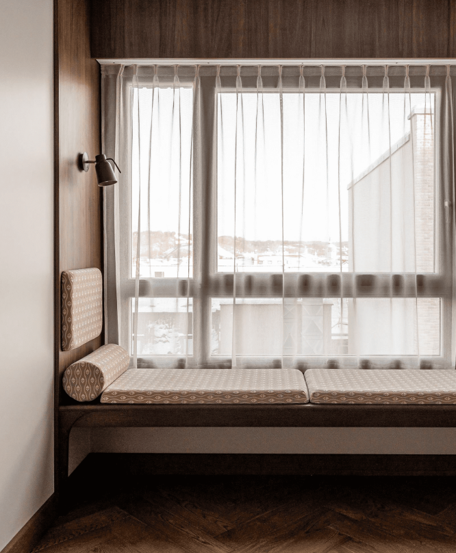
Historically, Neringa was known solely as a restaurant; today, it encompasses a hotel, three distinct bars, and the legendary restaurant, now revitalized. This growth necessitates a thoughtful reevaluation of its visual identity.
Approach
Contextual Analysis
Stakeholder Engagement
Competitor Analysis
Brand Positioning Strategy
Concept Creation
Ecosystem of Means
The Challenge
What are the key identity elements that should be highlighted in a modern design language?
The Context of the Challenge
Neringa aims to preserve its storied image and the aura that has characterized the venue for decades, while also presenting itself as a modern and prestigious complex in Lithuania’s capital, adapted to the 21st century. Following a major transformation that included service expansion and building reconstruction, there emerged a need to refresh the brand’s identity and create a comprehensive visual identity system that unifies all products and services under the Neringa brand.
The Insight
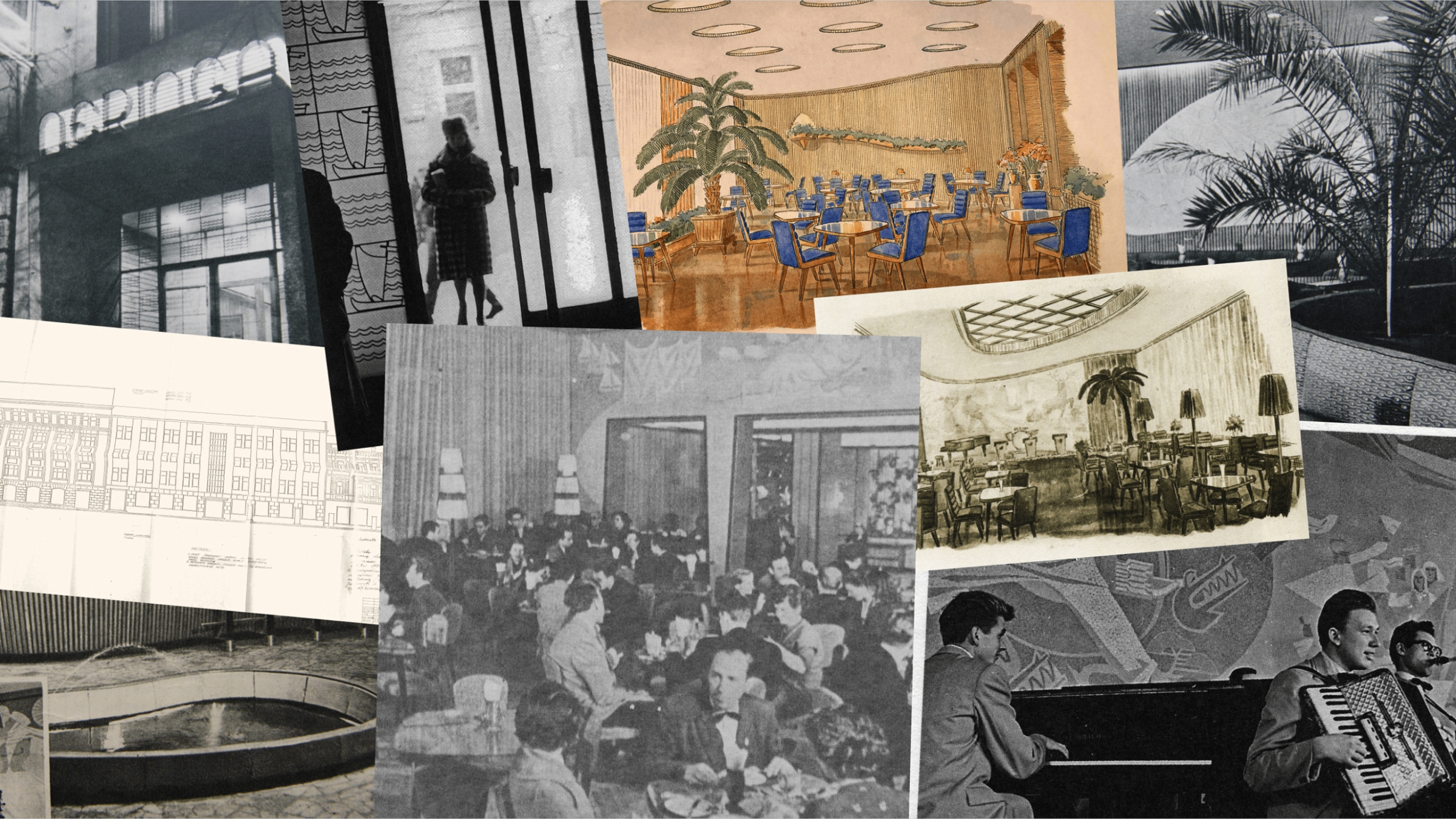
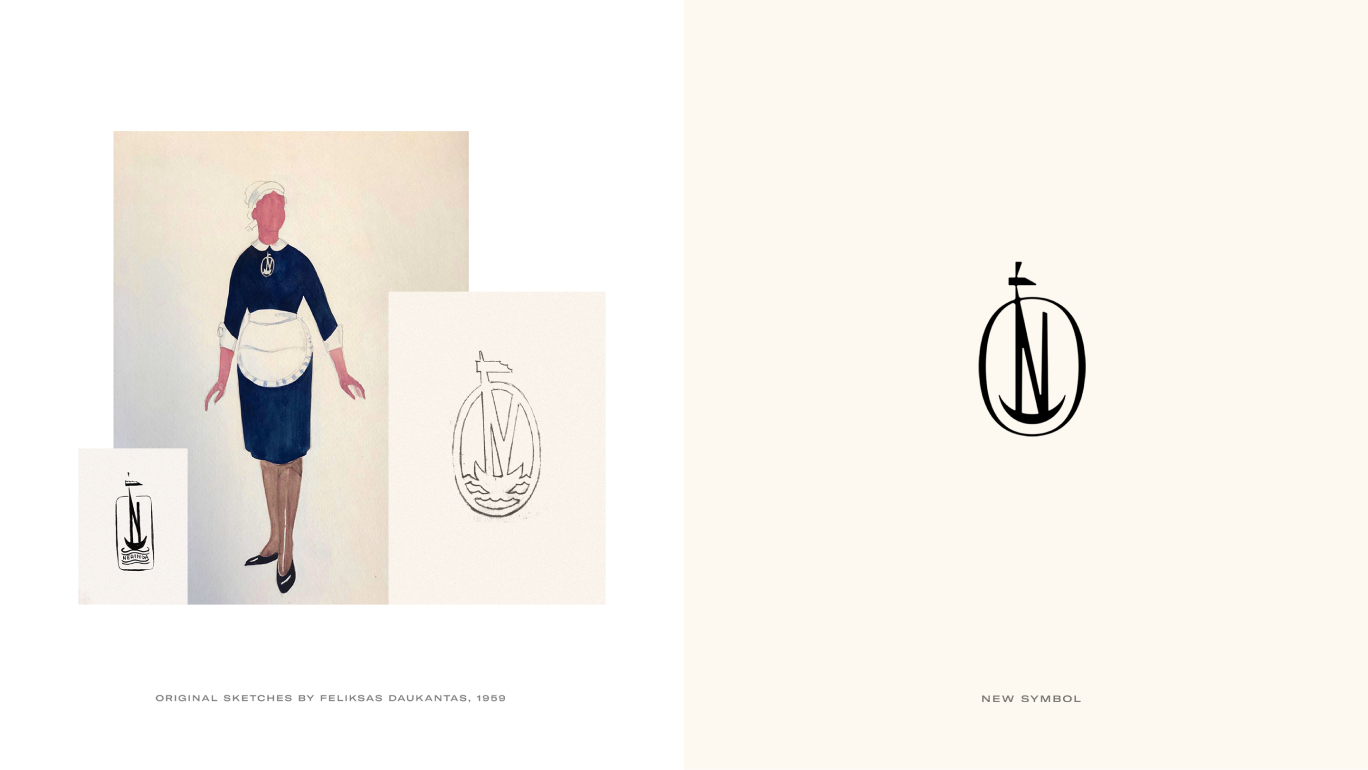
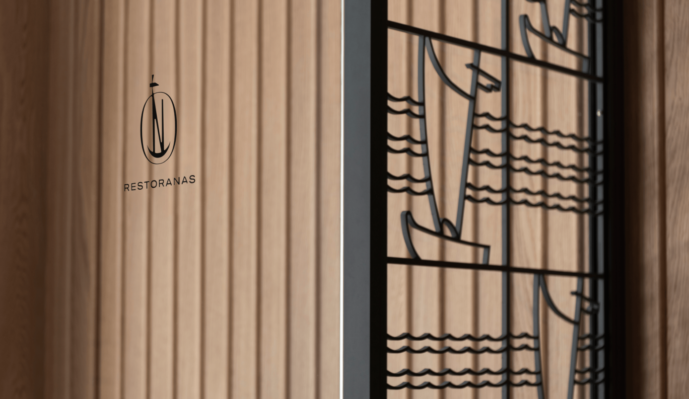
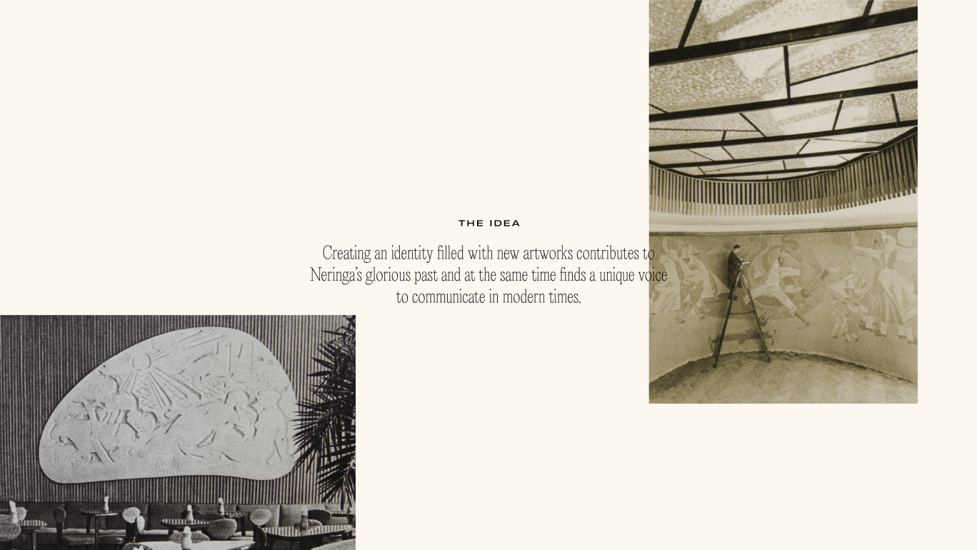
The creation of the visual identity was primarily informed by historical context. A key discovery was sketches and variations of the old Neringa logotype by Feliksas Daukantas, the founder of the design school in Lithuania. His innovative approach to design in Soviet Lithuania inspired our process and added excitement to the development of the new identity.
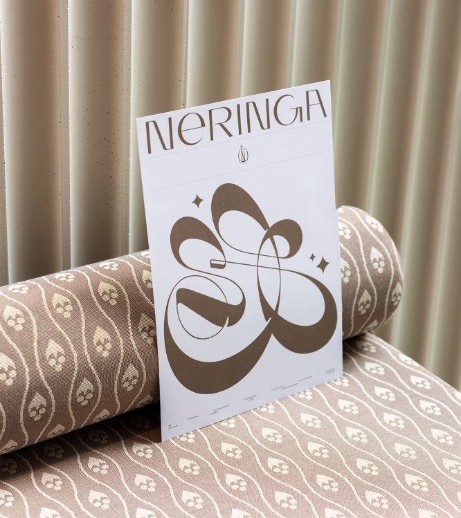
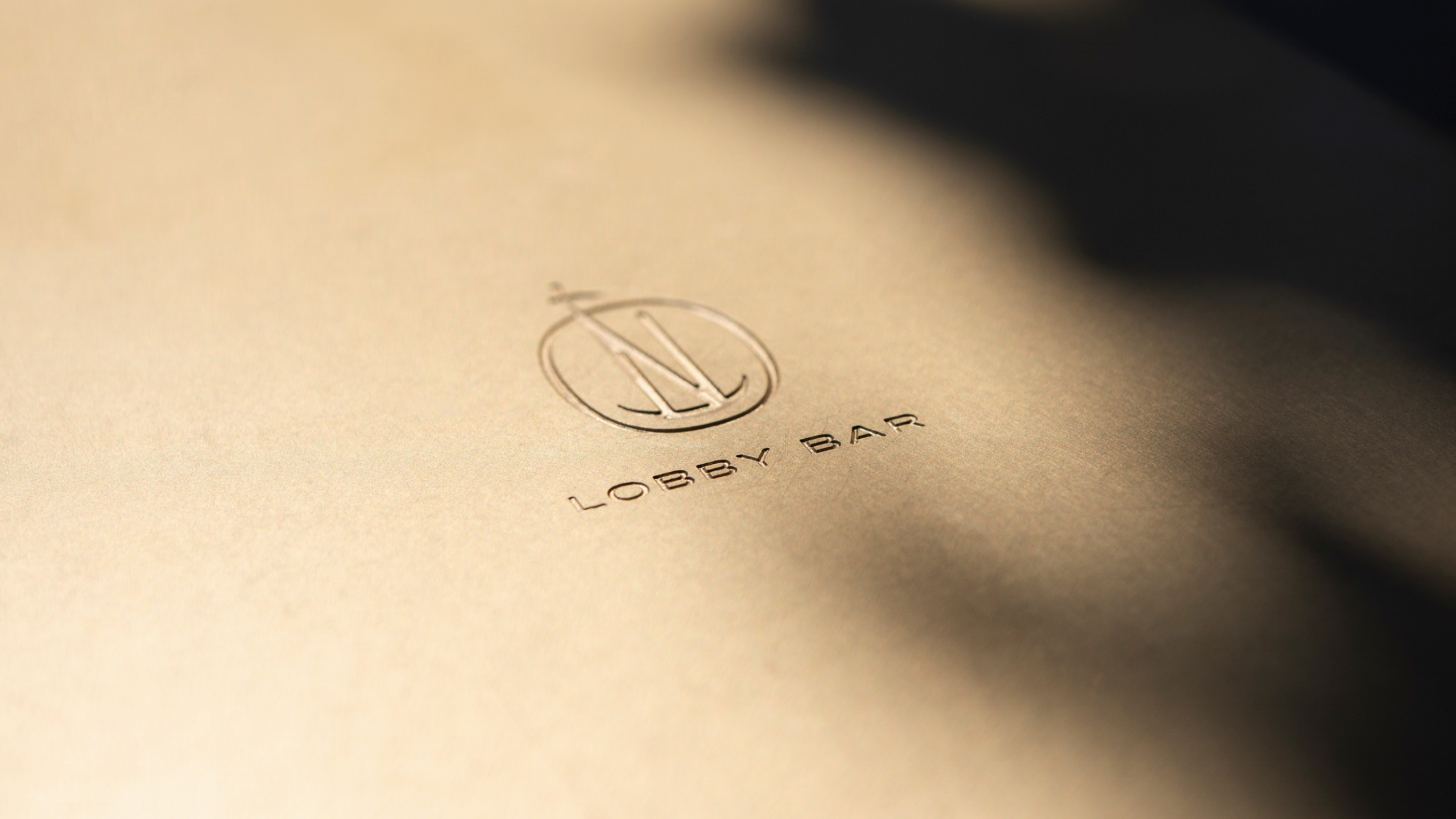
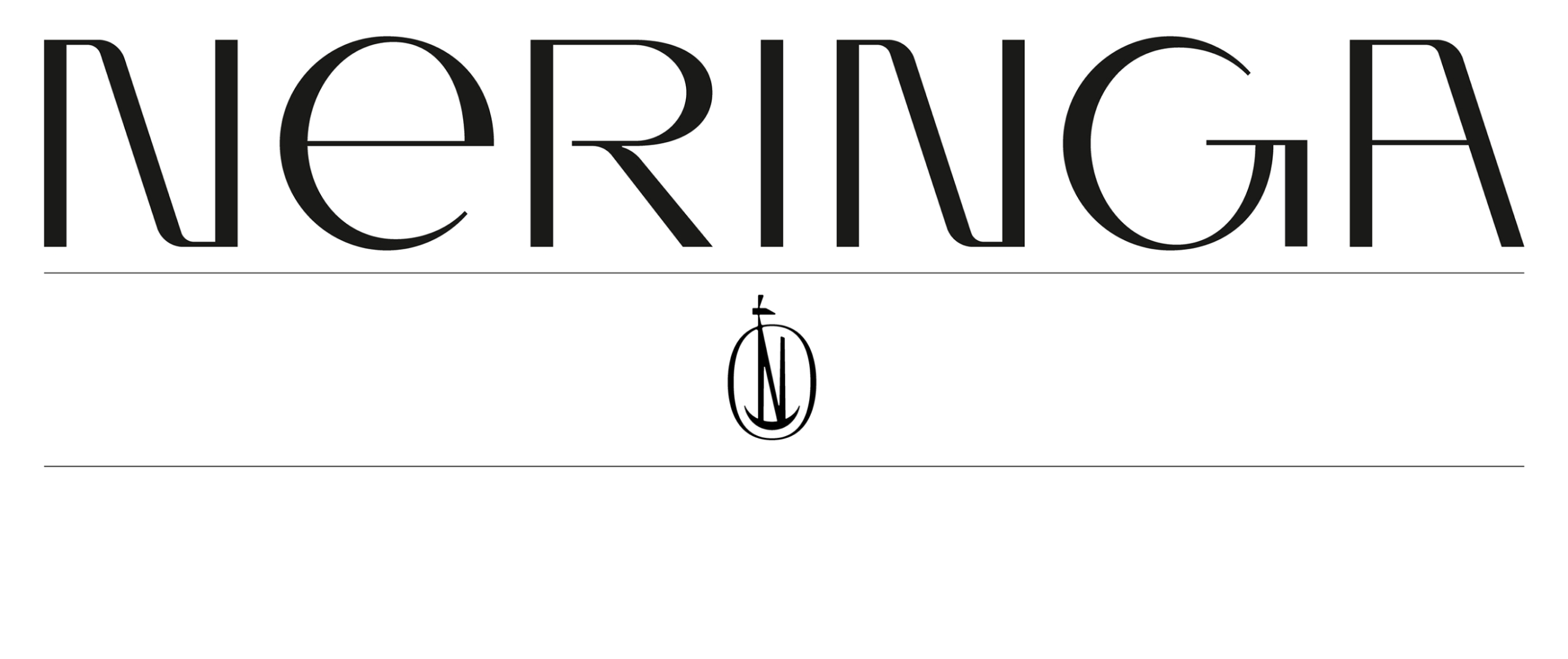
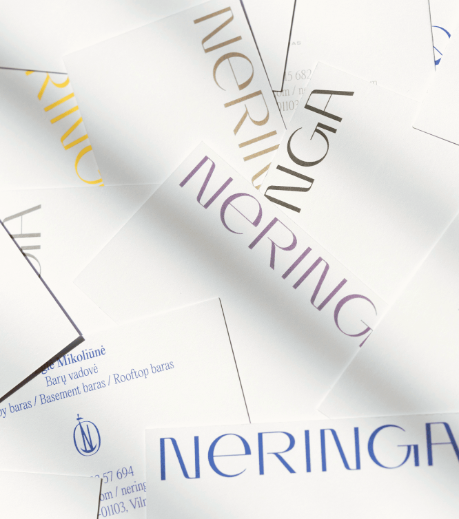
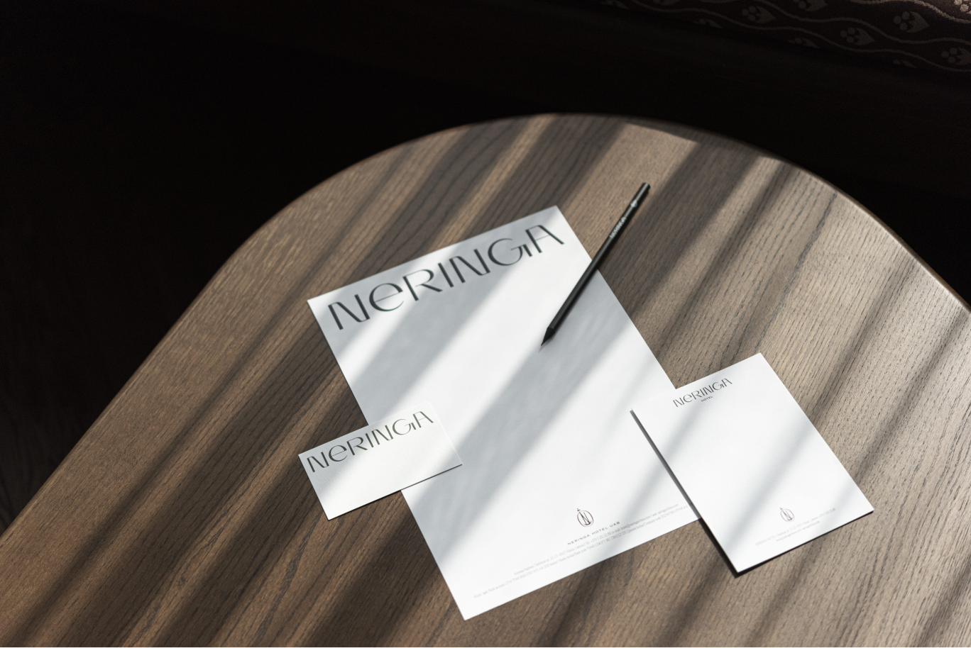
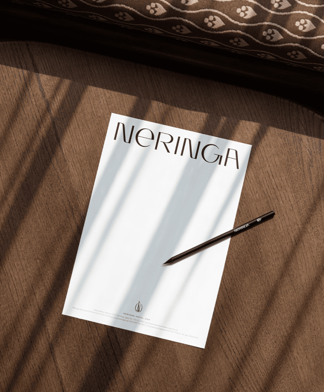
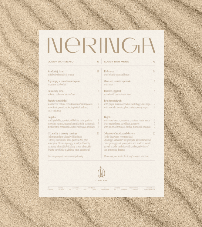
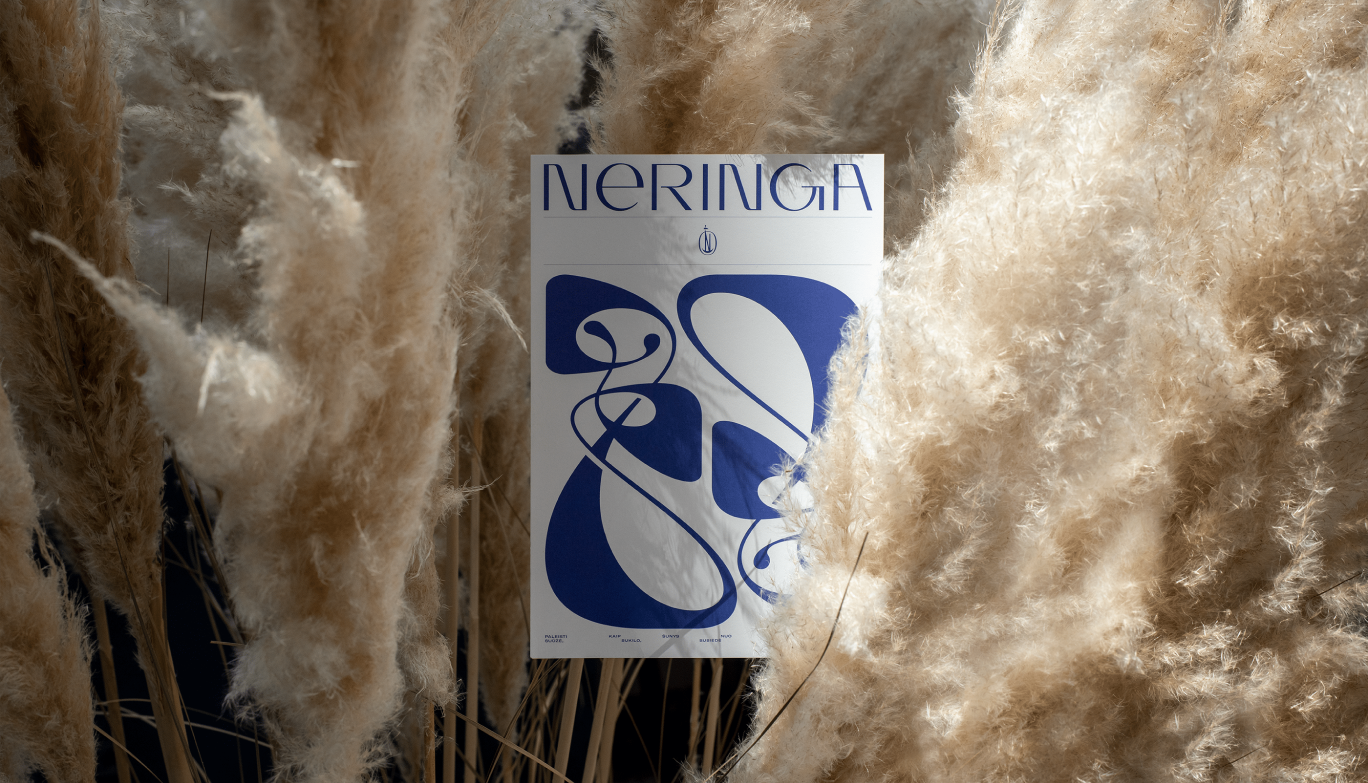
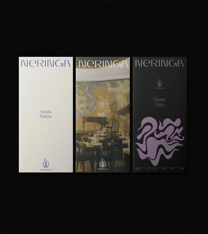
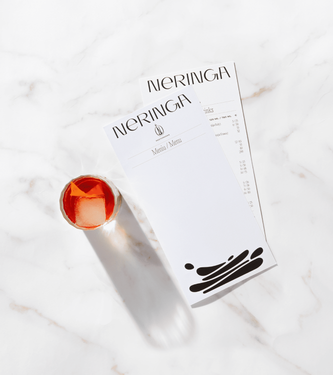
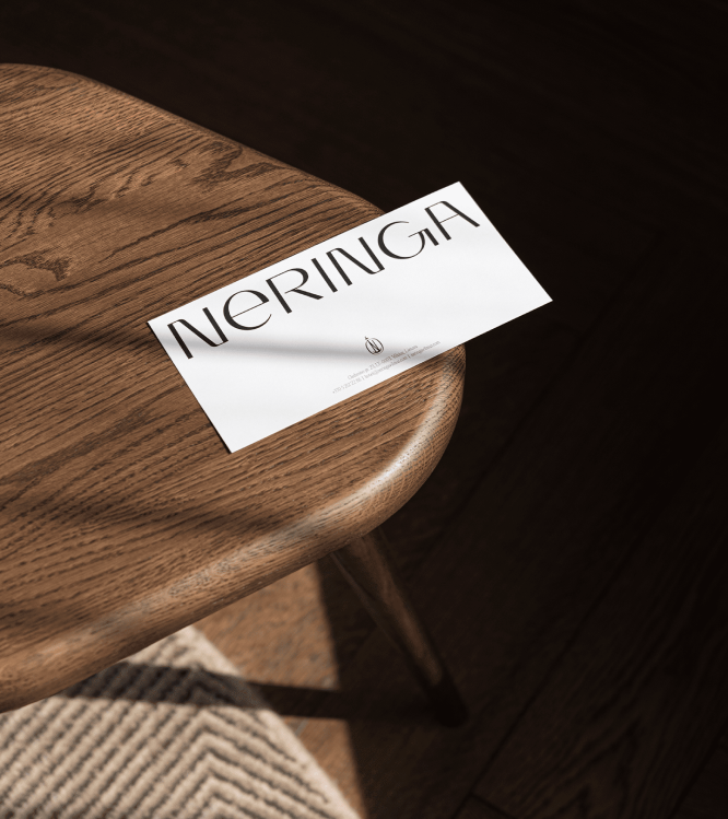
Logotype
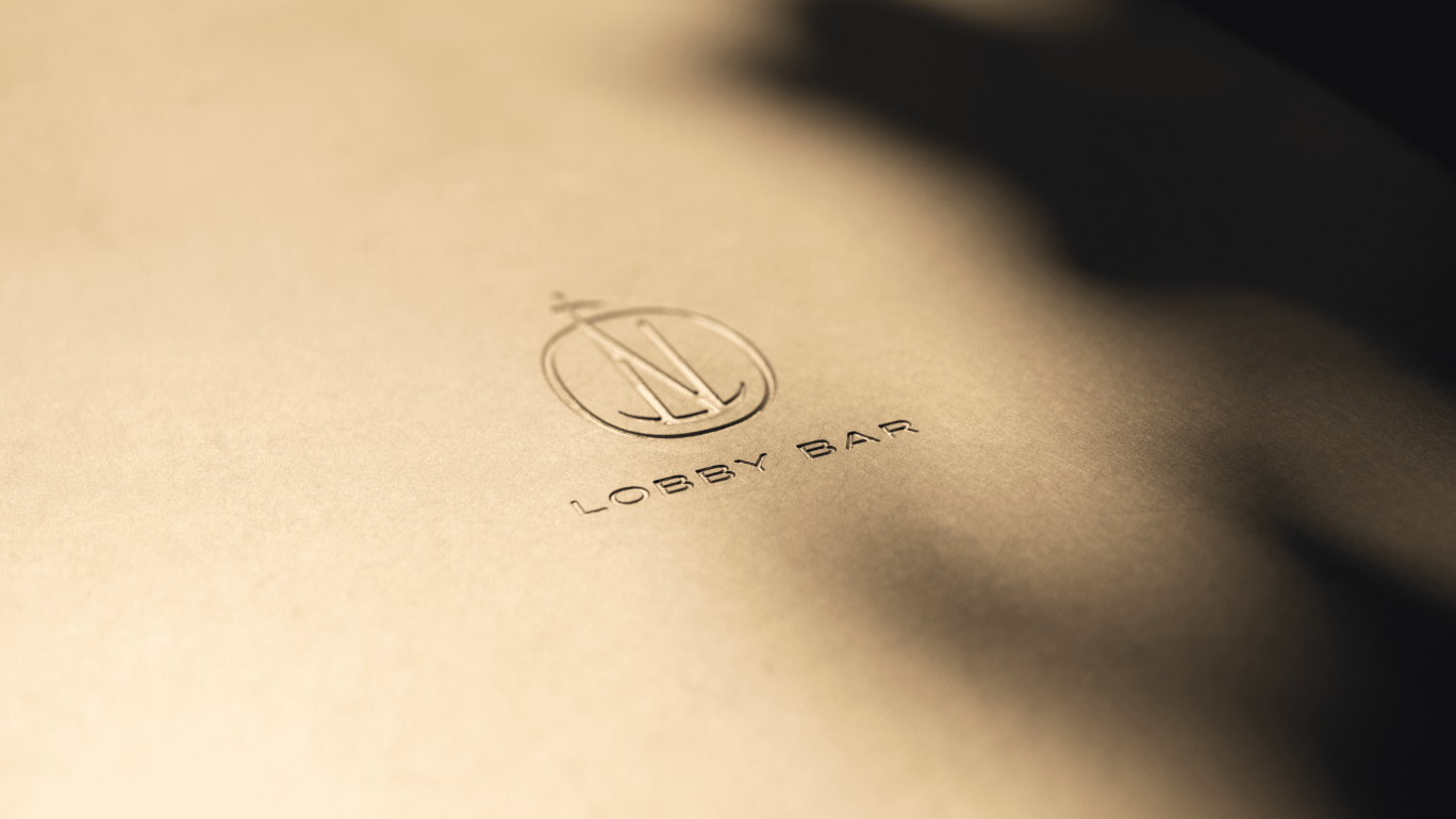
We created a completely new logotype for Neringa, which consists of two parts: the symbol and typography. The symbol was created based on the sketches of Feliksas Daukantas, and the typographic part was inspired by the fairytale about Neringa and the style of the 60’s, which was discovered in magazines of that time. The letters of the new logo are unique and have been created specifically for this case.
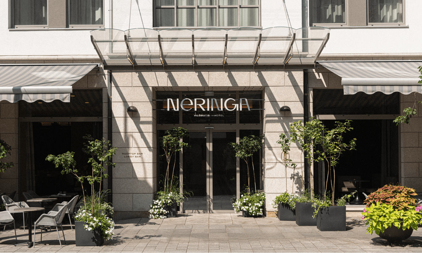
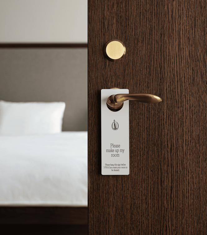

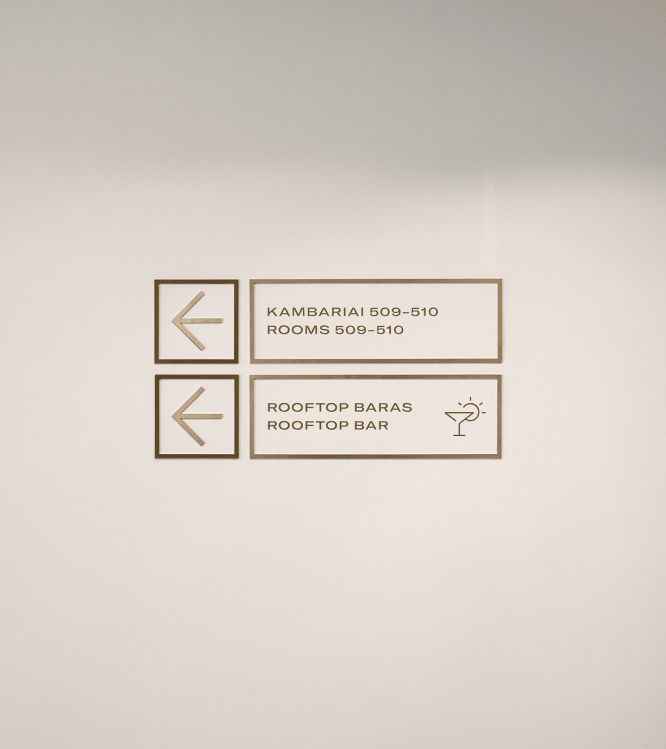
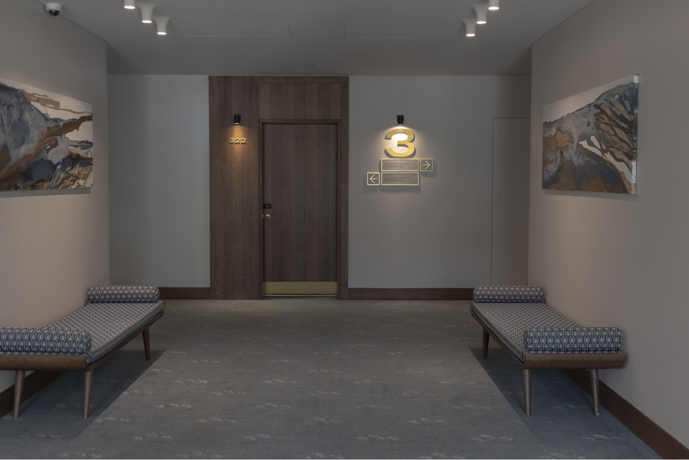
Visual Identity
The general mood of visual identity is related to the trends of the 60s. Not only was Neringa opened during that year, but the whole design perception in Lithuania was at its peak during the 60s.
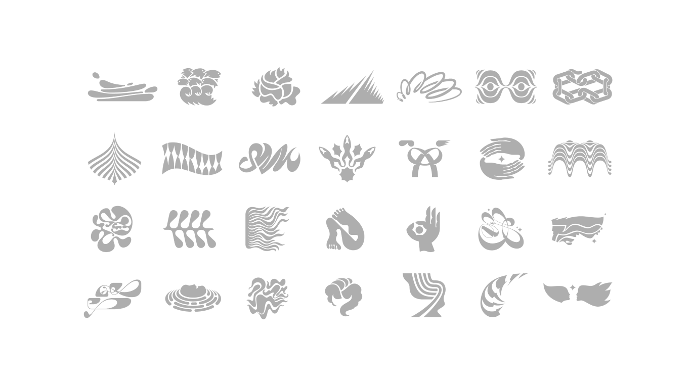
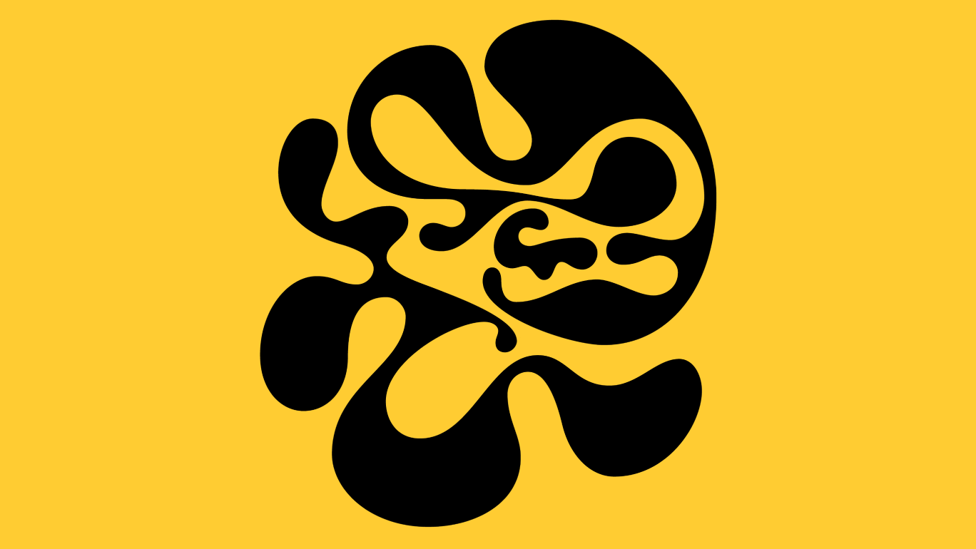
Neringa has maintained its identity because of the already existing artwork. These pieces are the only tangible objects that have returned to their places after years of reconstruction. We decided to reflect this original artwork in all communication channels, adding some new illustrations on top. To create meaningful illustrations, we used a fairytale about a magic land near the Baltic Sea called Neringa, which was written by Eduardas Mieželaitis.
The Change to the Context
Kept the Story: The historical significance and ambiance of Neringa were preserved with surgical precision and have been recognized by various audiences. This careful translation of the past into the present ensures that the essence of Neringa’s storied past continues to resonate.
Modernized the Language: The visual language has been updated to appeal more broadly across different cultural and age demographics. This modernization helps the brand connect with both new and existing patrons by speaking a more contemporary visual dialect.
Integrated the Feel: The unique identity now permeates various aspects of the infrastructure and is visible online, creating a consistent and recognizable feel across all platforms. This integration ensures a cohesive experience for all who interact with the brand, whether in person or digitally.