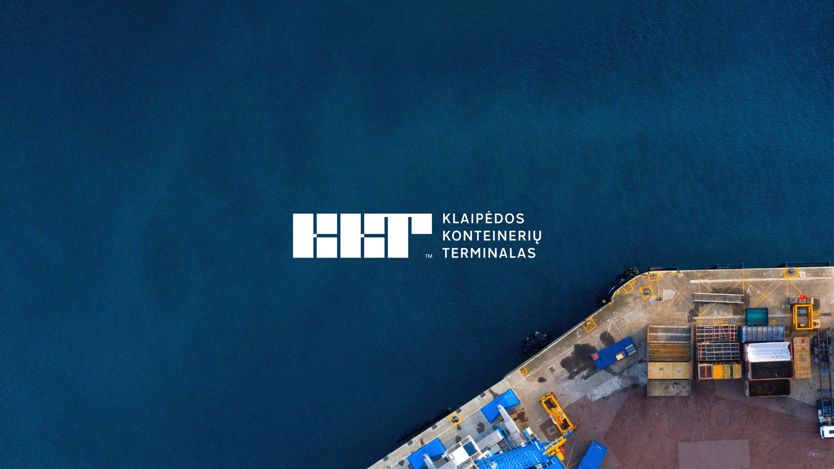
Klaipėda Container Terminal
- Paulius Budrikis
- Mykolas Saulytis
- Inga Milkintienė
Klaipėda container terminal
Logistics
Visual identity, Branding
2018
Klaipeda Container Terminal, a pioneer in its field, is among the leading stevedoring companies in the Baltic States. Founded 26 years ago, it has not seen a visual language update since 1996.
The Approach:
Stakeholder Engagement
Competitor Analysis
Concept Creation
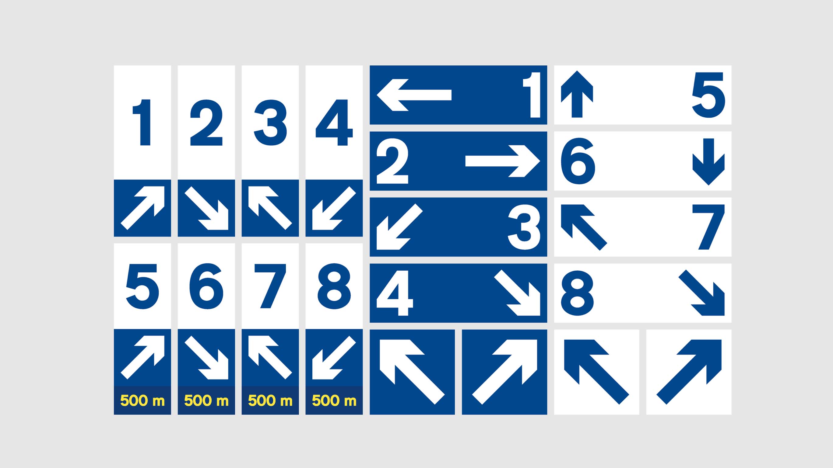
Visual Identity
Change Management
The Challenge
How can we encapsulate the terminal’s extensive experience and history in the B2B sector through visual language?
The Context of the Challenge
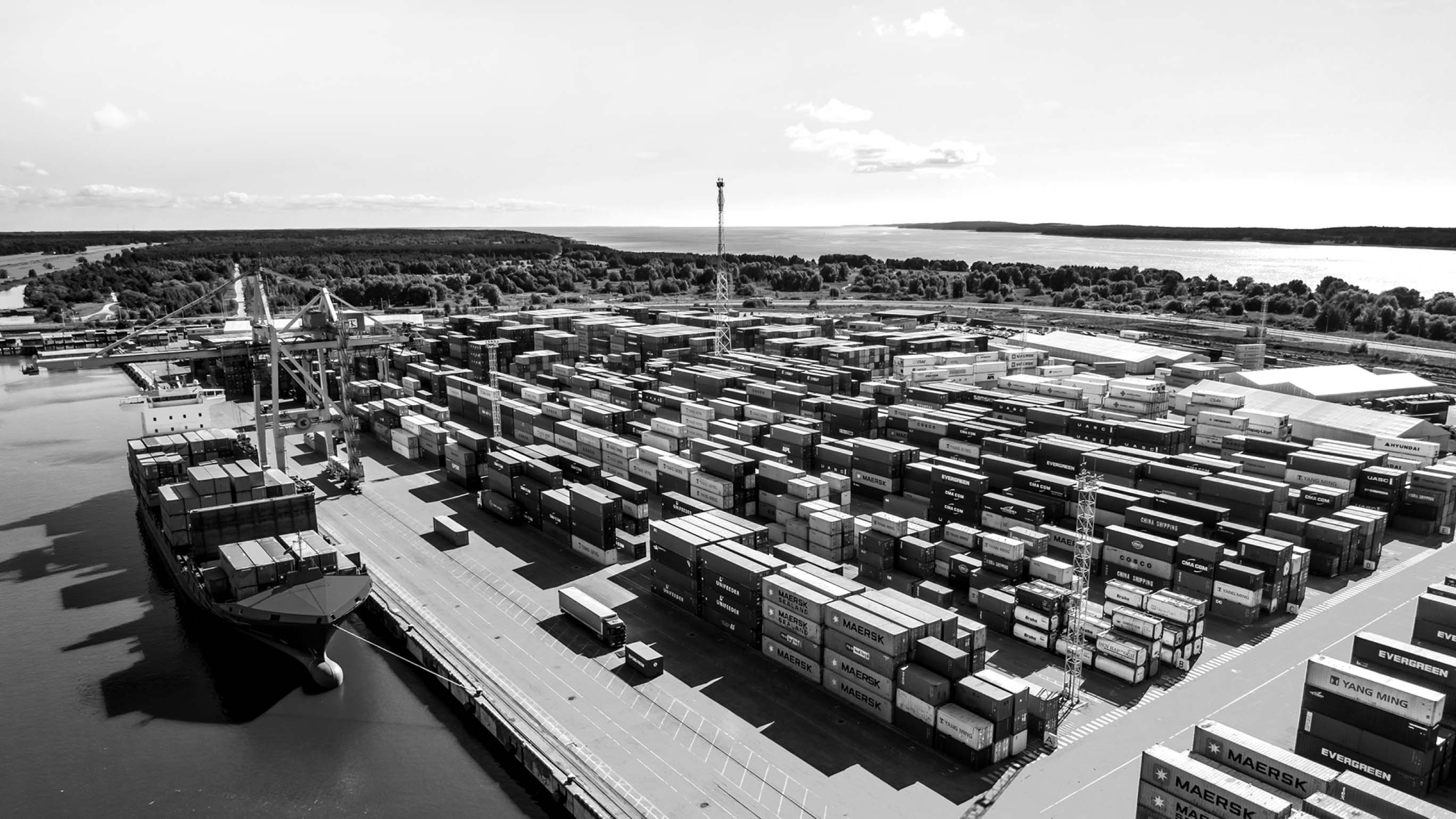
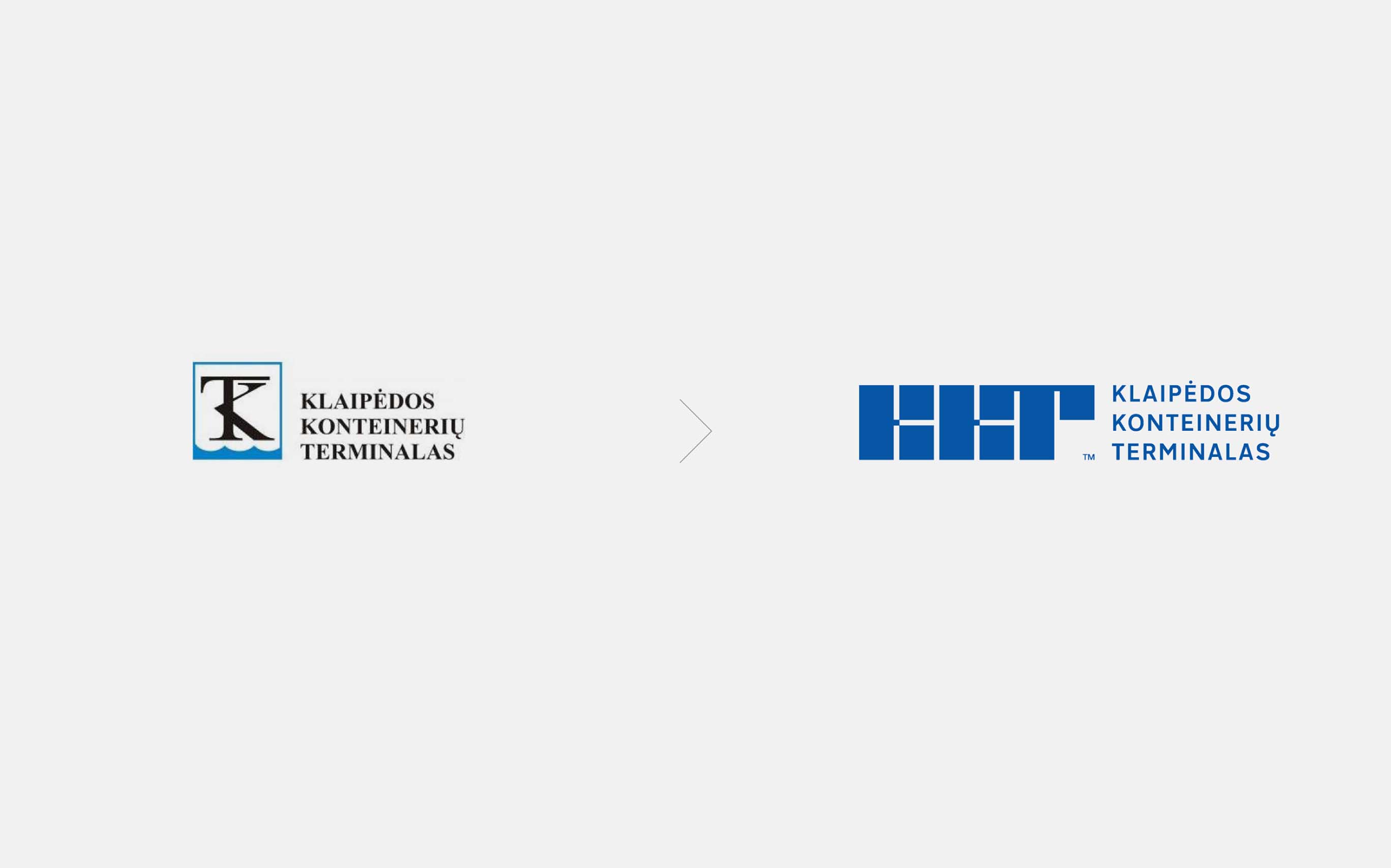
Despite being a premier cargo terminal in Lithuania—servicing over 900 vessels per year with a capacity of 6 million tons—KKT’s visual identity has remained unchanged since its inception in 1996. Even after its renaming to Klaipeda Container Terminal, the logo stayed the same. The outdated logo became insufficient to represent the company’s significant growth and evolution over 25 years.


The Insight
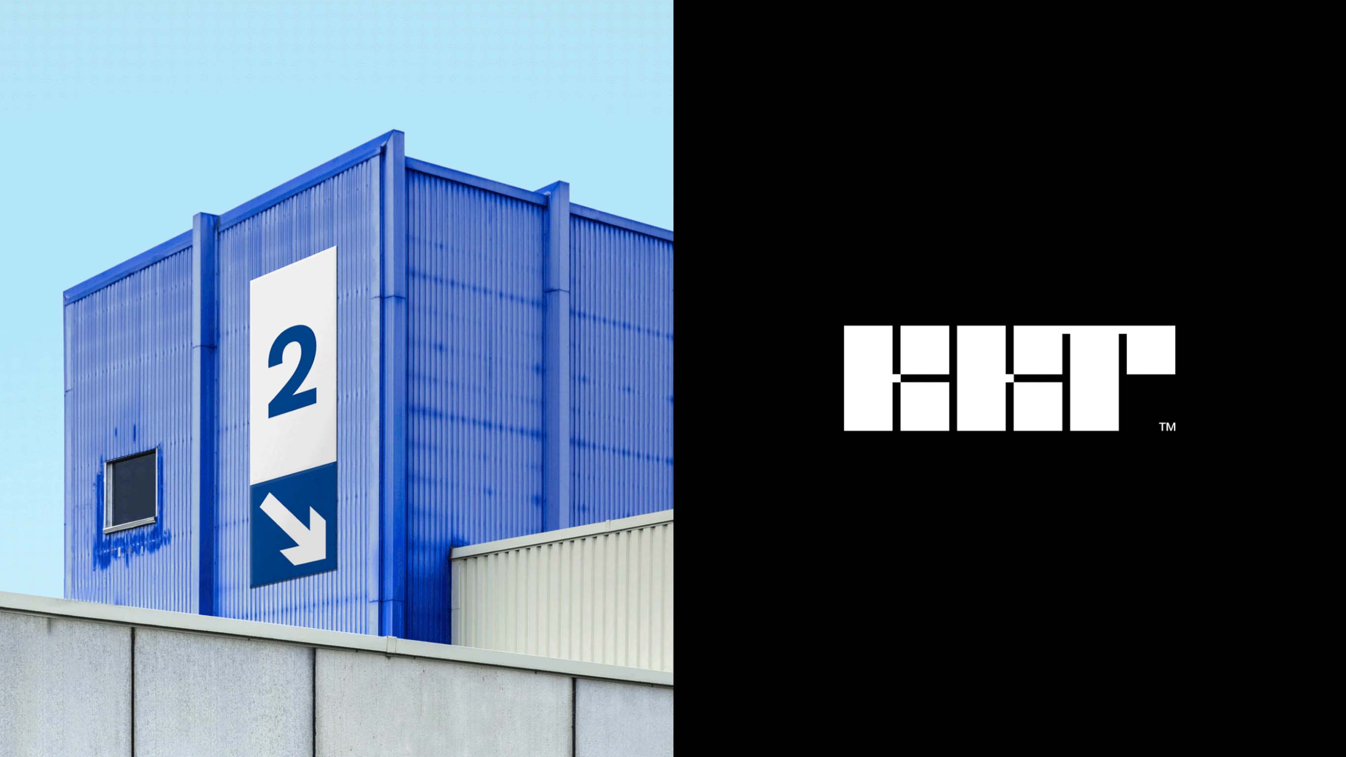
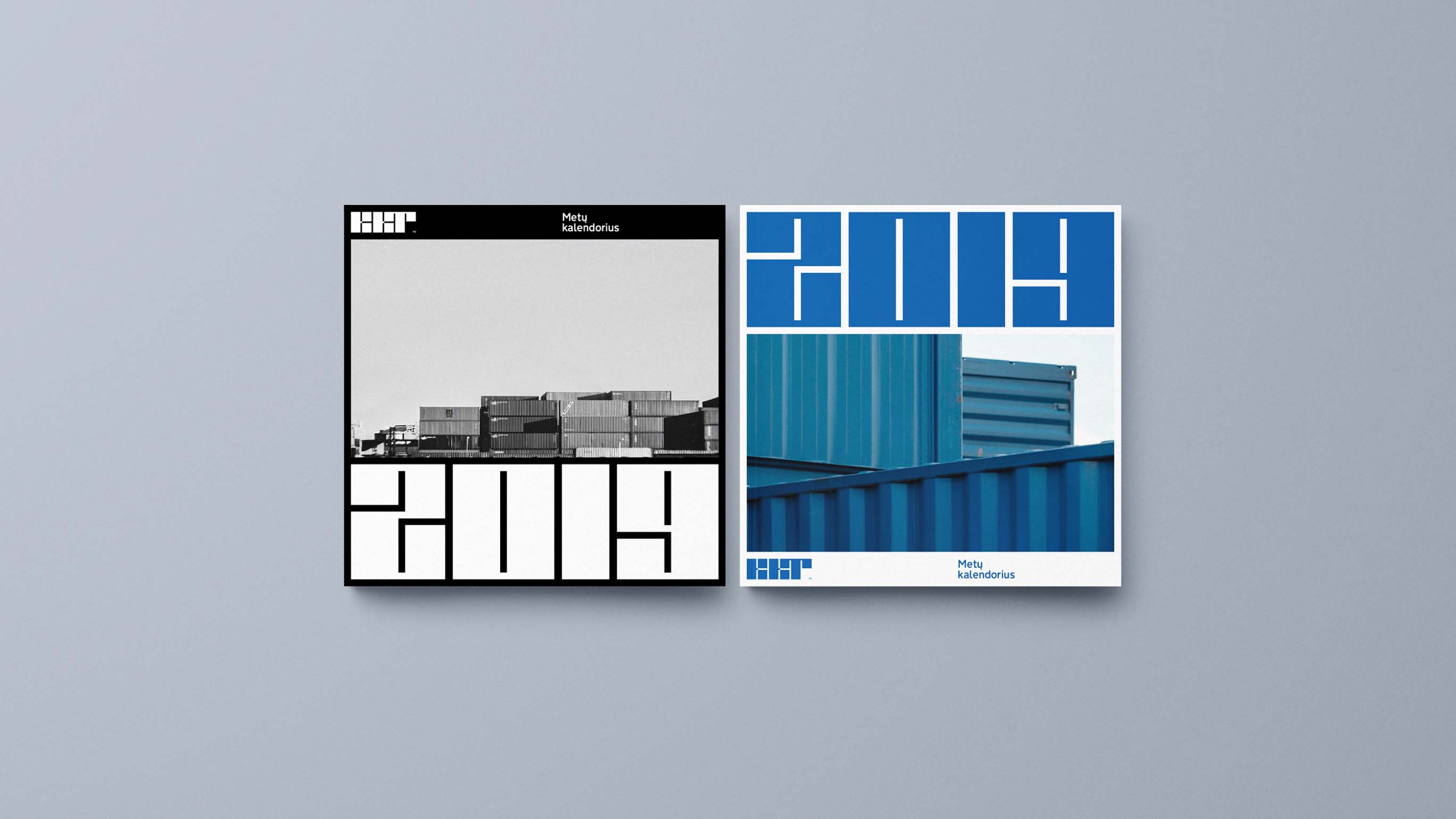
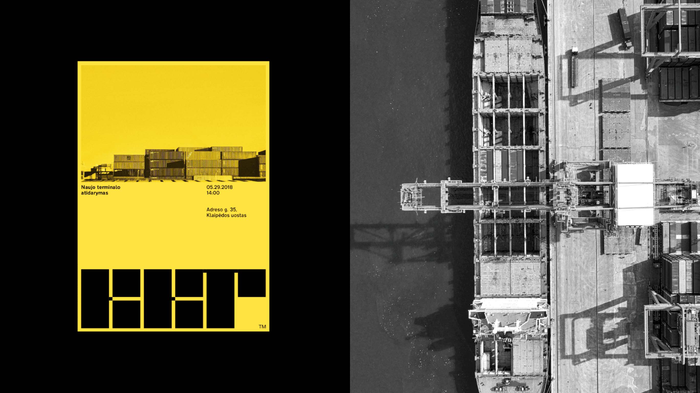
It was only after visiting the terminal and witnessing the operations firsthand—the immense containers stacked high, cranes as tall as five-story buildings operating with near-perfect precision—that we realized the logo and overall visual identity must reflect this structured boldness. The container, central to the terminal’s operations, inspired the new logo, designed to convey stability and reliability and often used as the sole graphic element on various brand assets.
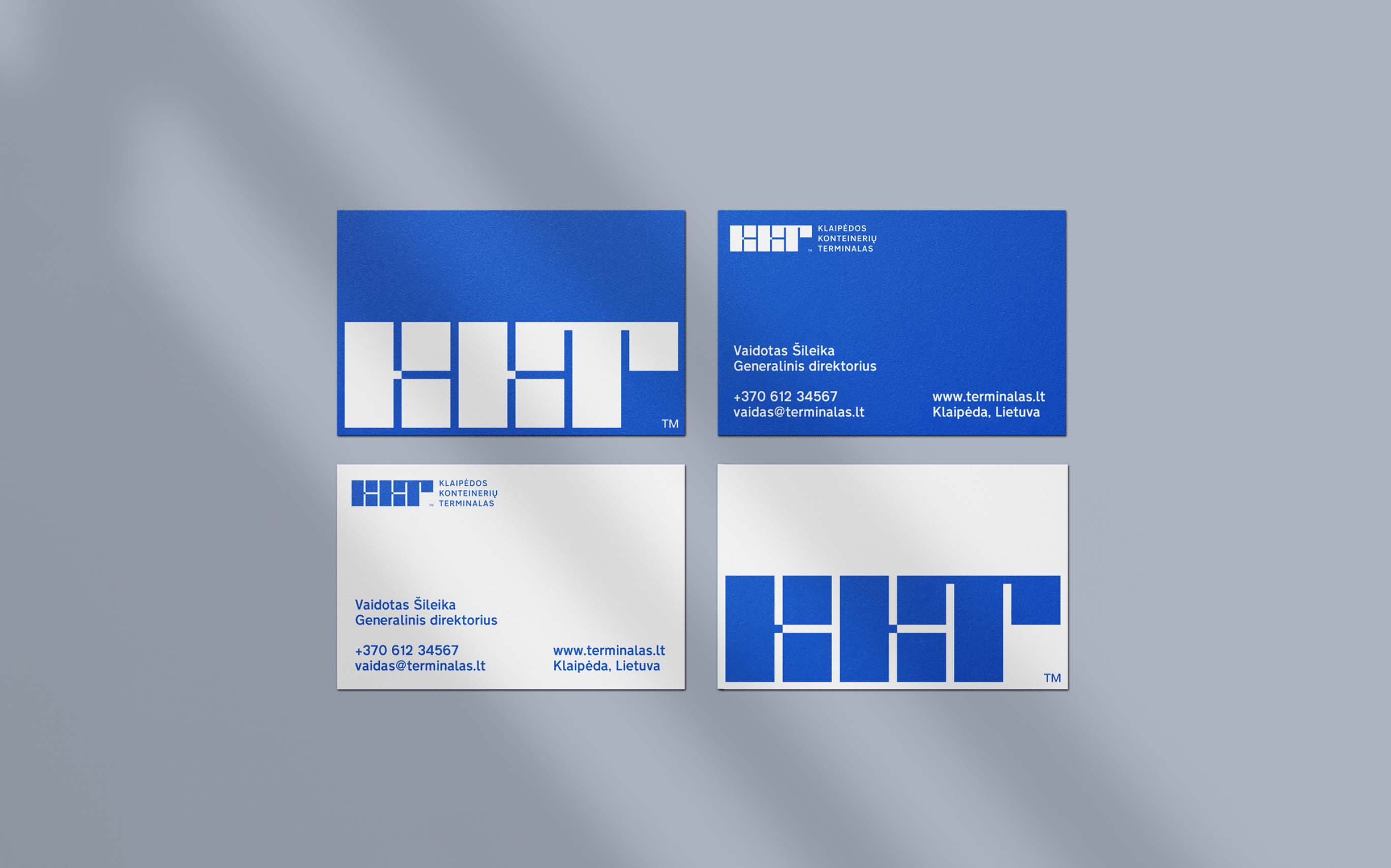
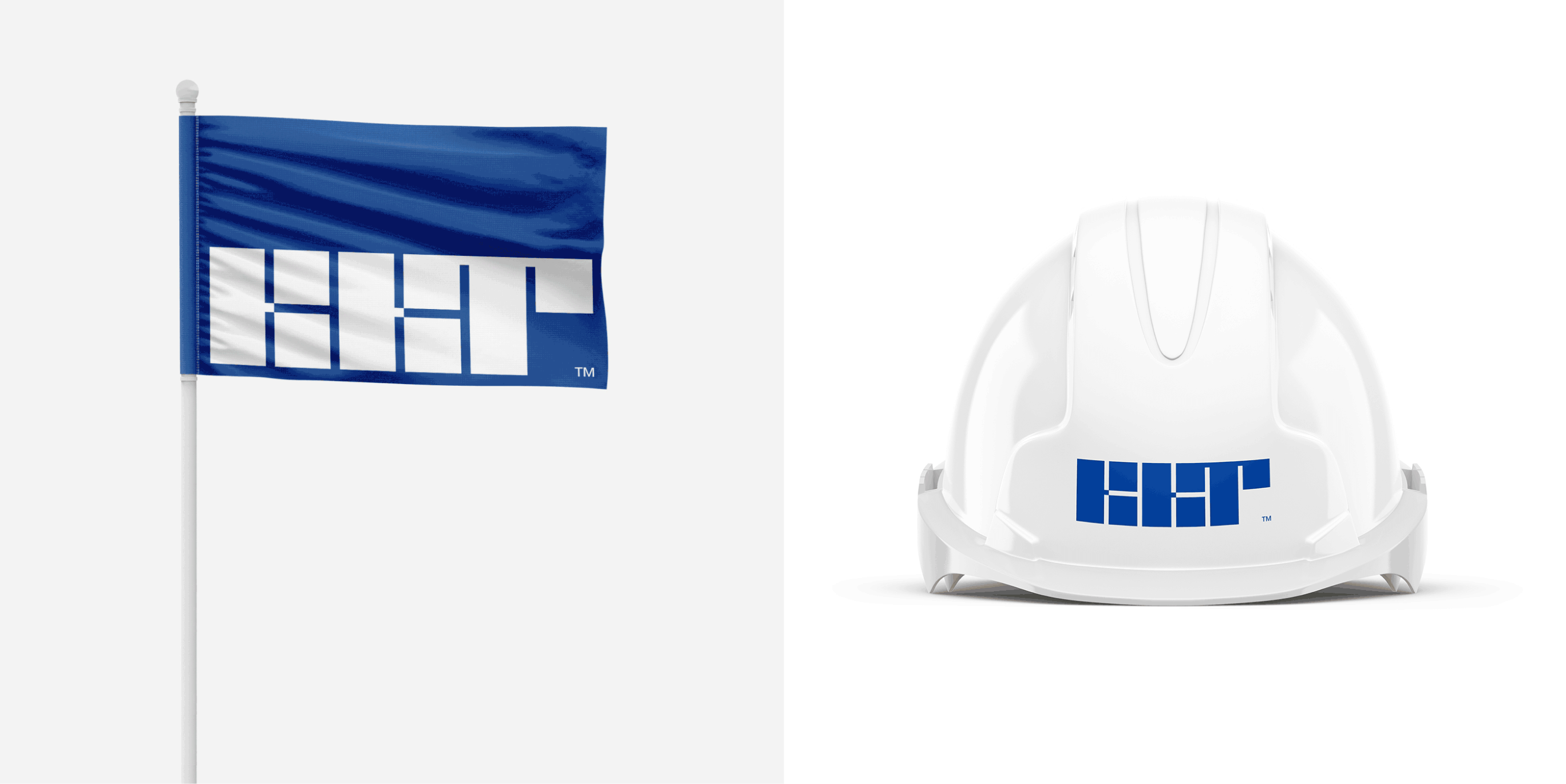
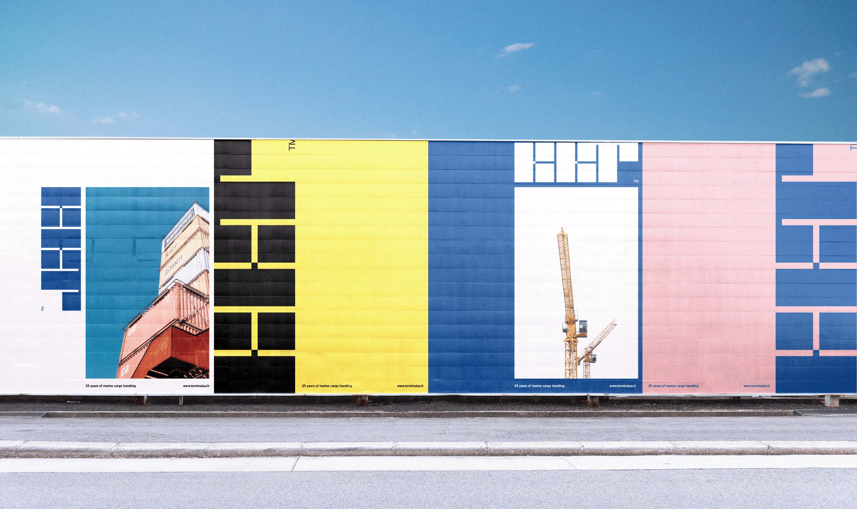


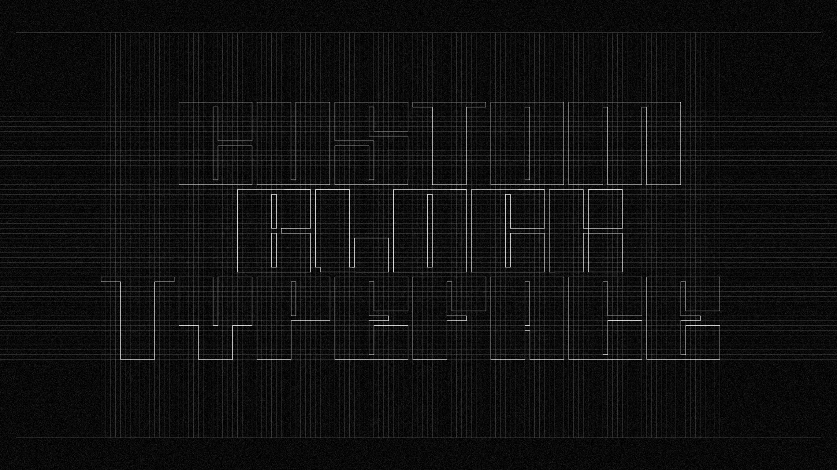
Terminal Block
We created a custom block letter typeface based on the logotype. It’s a bold modular typeface used to create strong typographic visuals which is one of the key identifiers of KKT’s visual identity.


The Change to the Context
Improved Recognition: The brand update has served as a statement of enhanced client care in the B2B sector.
Simplified Communication: The new visual language architecture has enabled teams and individuals to utilize brand elements more effectively.
Defined Value: The refreshed brand identity more clearly communicates the company’s value.