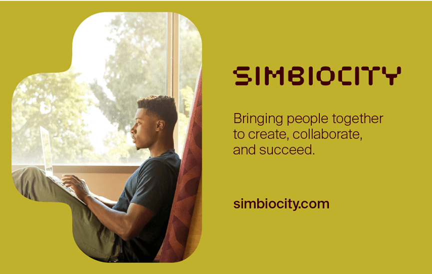
Simbiocity
- Jurgita Babilčiūtė
- Silvija Zasimauskas
- Leta Dombrovskytė
- Jonas Liugaila
- Benjaminas Alimas
- Deividas Juozulynas
- Antonas Deduchovas
- Paulius Budrikis
- Mykolas Saulytis
- Regina Terekė
- Zigmas Vagonis
- Miglė Lapienytė
- Dalia Imbrasaitė
- Rokas Adlis
- Vytautė Jonaitė
- Ignė Juškevičė
Simbiocity
Real estate
Visual identity, Communication campaigns, Digital environments, Brand positioning
2025
Simbiocity designs flexible workspaces that adapt to the evolving needs of businesses and modern work culture. From professional reception services to office design, everything is provided under one seamless service. Our environments foster productivity, well-being, and balance—so you can focus on what matters most: your business.
Approach
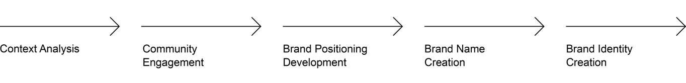
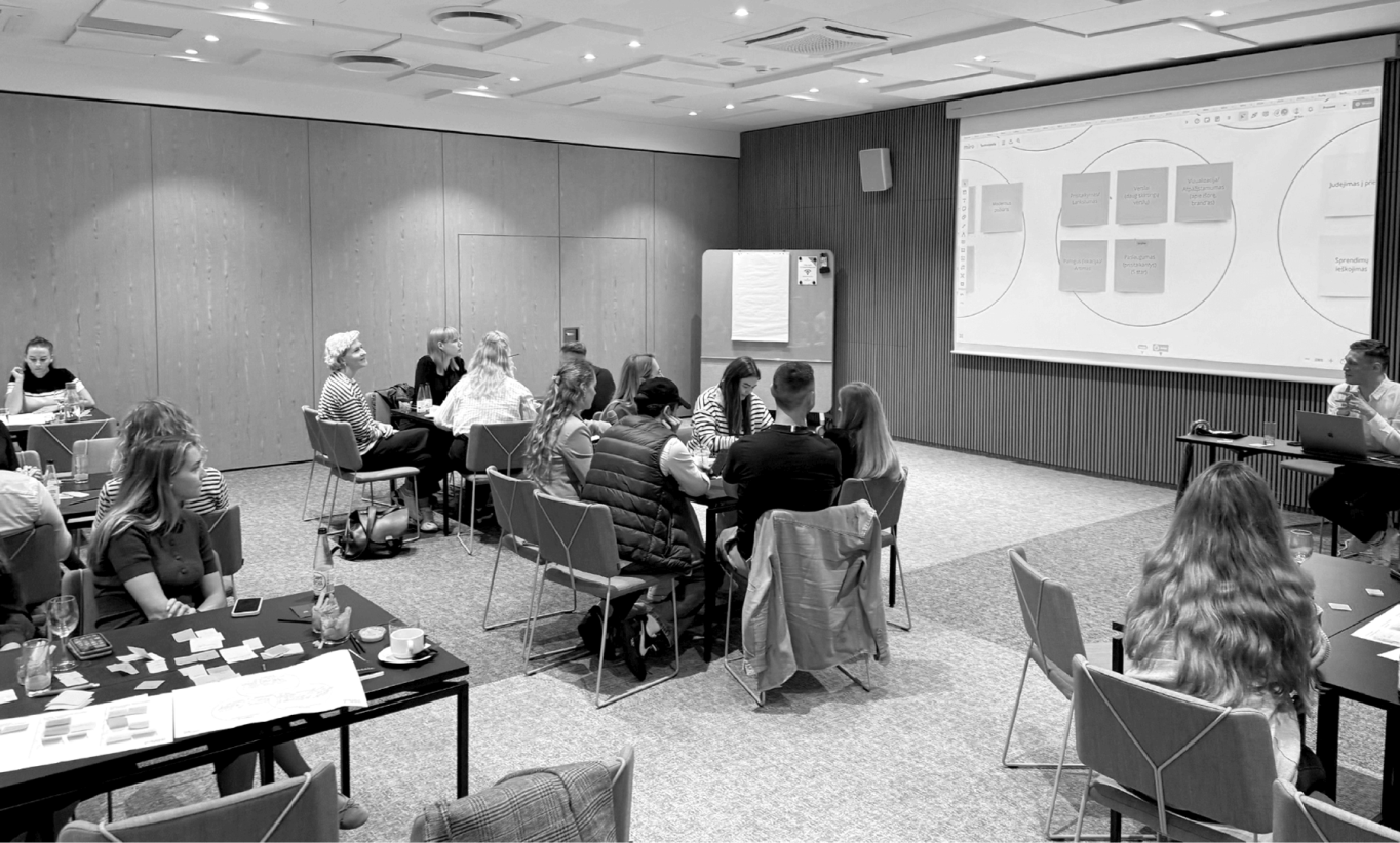
Engagement Sessions – Gathered qualitative and quantitative insights through discussions with key stakeholders, and a special one dedicated to the community itself.
Data Sensemaking – Interpreted findings to refine brand positioning.
Brand Positioning – Developed a strategic framework for visual language and messaging.
Framing the Narrative – Crafted the communication concept.
Creating the Name – Originated the name for the new brand.
Visual Conceptualization – Designed initial visual concepts to align stakeholders.
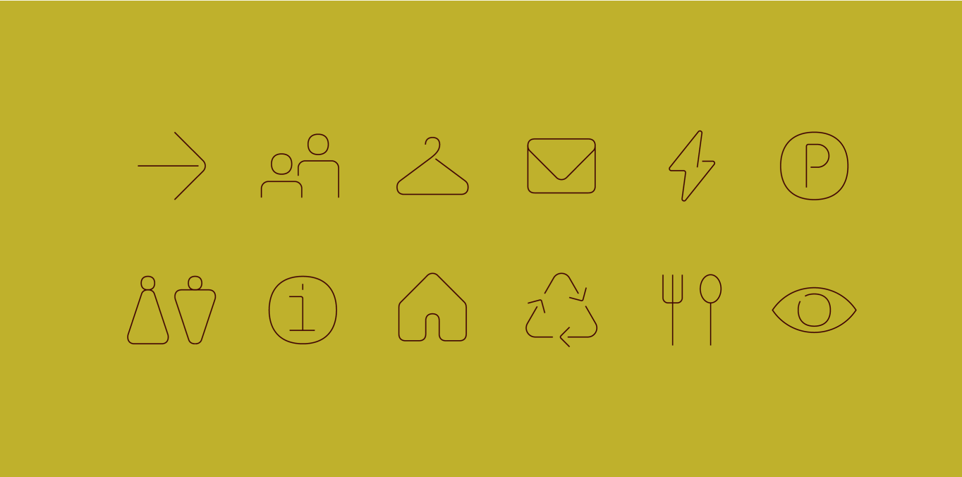
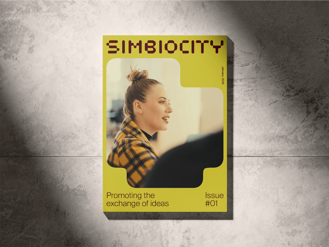
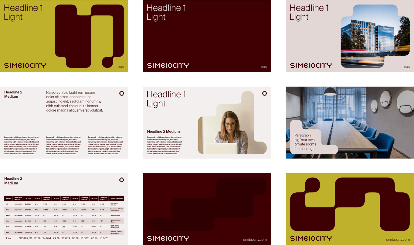
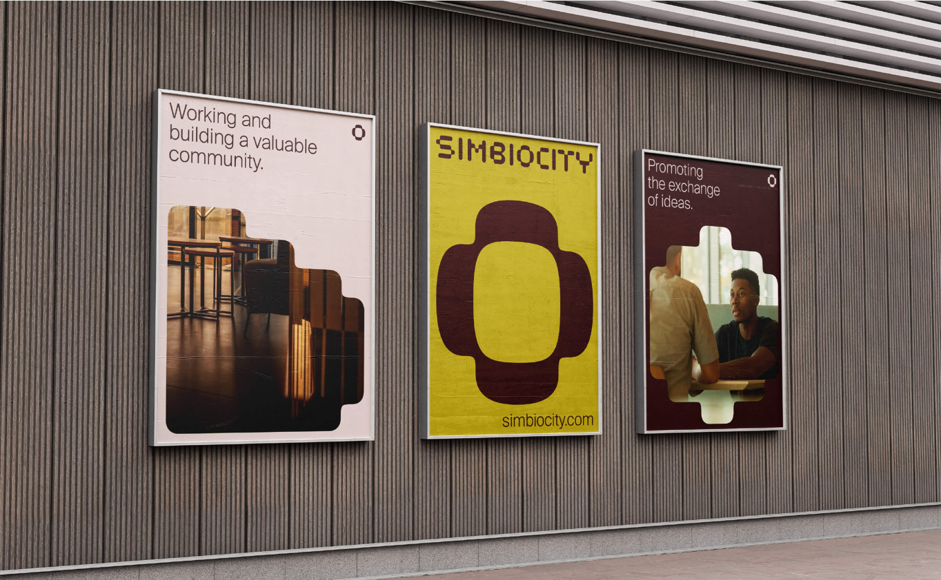
Visual Identity – Created a logo, graphic elements, and a cohesive visual system.
The Challenge
How do we shift the perspective toward the service through a brand transformation?
The Context of the Challenge
Previously known as Technopolis, Simbiocity sought to expand its service offerings and redefine its market position. In a saturated real estate landscape filled with competing developments and services, the challenge was to communicate Simbiocity’s unique value in a way that truly resonated with its audience.
“Simbiocity” spaces are designed to enhance clients’ productivity and well-being. Flexible, individually tailored services and workspaces free clients from unnecessary worries, allowing them to focus on what truly matters.
“Simbiocity” provides the opportunity to seamlessly balance work, relaxation, and social life in one place. Comfortable and functional office spaces, smoothly integrated with other parts of the town, enable clients to work and live without any disruptions.
The “Simbiocity” team continuously improves the work environment by considering client needs, experience, and data. Client growth and success are the top priorities, ensuring that office management remains at the highest level.
“Simbiocity” implements cutting-edge technologies and sustainable solutions to create a healthy, efficient, and client-oriented work environment. The goal is to help clients work more productively and feel better.
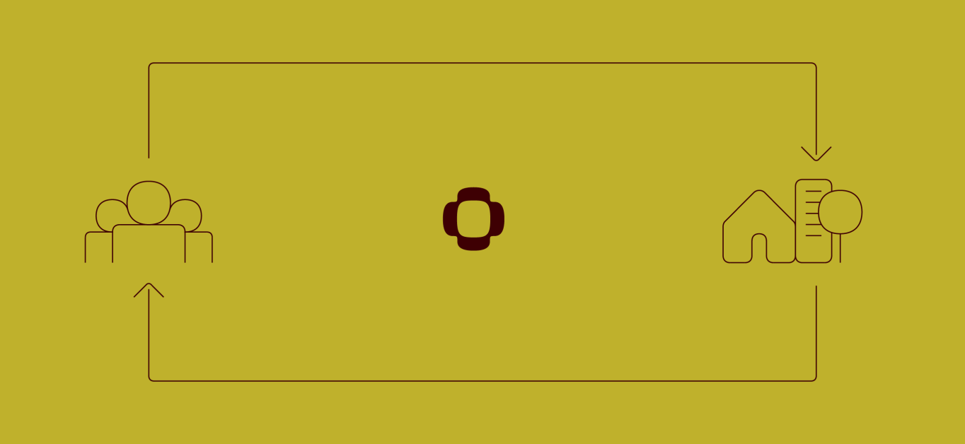
“Simbiocity” is an integral part of the urban fabric. Within this ecosystem, clients not only work but also contribute to the vibrancy of the city and become an essential part of a larger community.

The insight
The central figure of the visual identity is the human, the core focus of the entire Office Campus ecosystem. The design may incorporate subtle, organic elements that symbolize the natural interaction between people and space, conveying a rich concentration of diverse characteristics in one place.
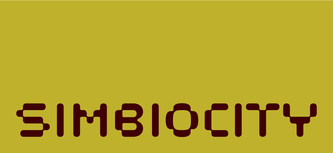
Logotype
The basis for these metaphors was tested through a research process involving the target audience, aiming to find delicate yet impactful solutions in this sensitive territory.
This principle extends to the logo as well. A broad color palette reflects the entire spectrum of emotions, while vibrant text and confidently used images allow for the creation of various situations in which individuals are encouraged to think and perhaps recognize themselve.


Visual identity
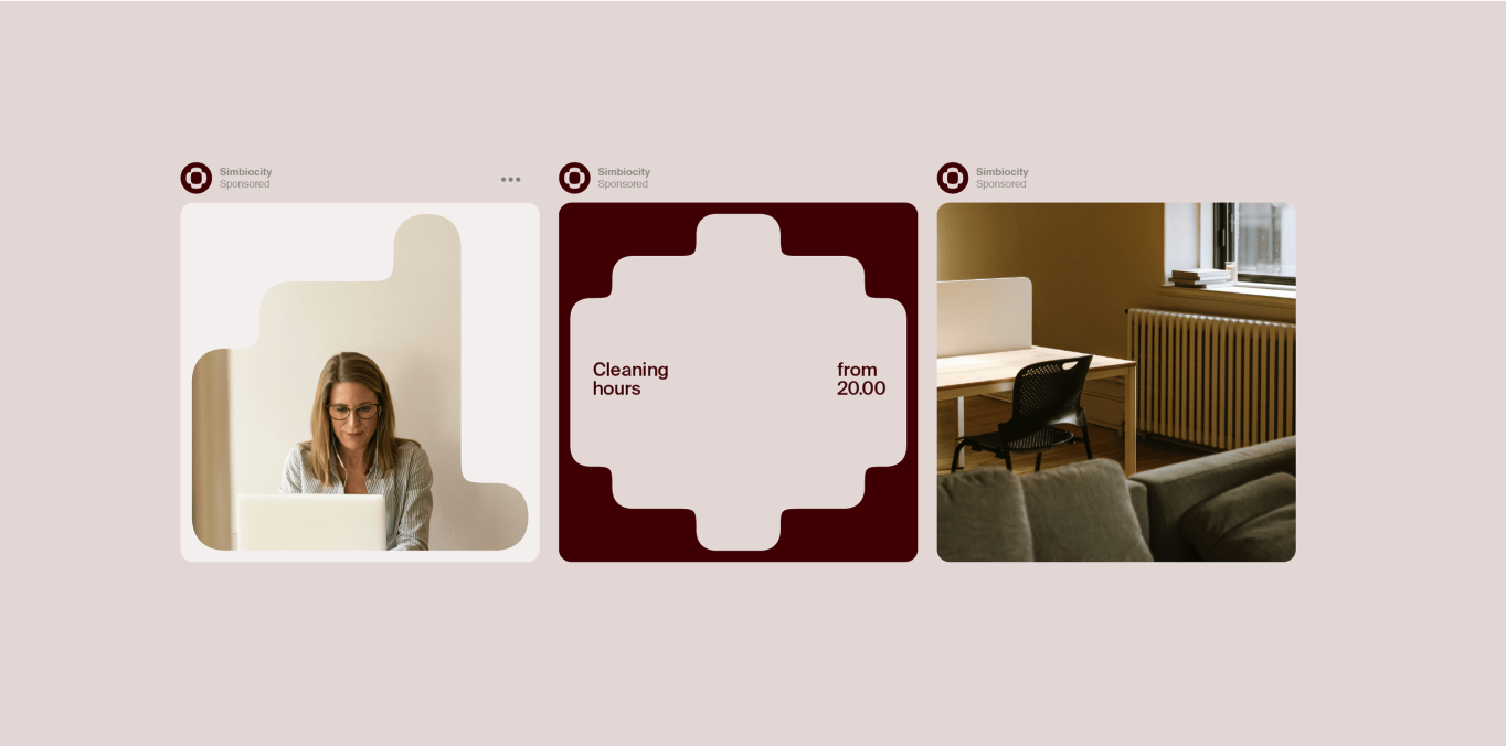
The “Simbiocity” visual language reflects the deep connection between individual ways of working and the collective strength that emerges when space fosters interconnectivity. This culture empowers individuals by shaping a unique work experience—where simple elements come together to create meaningful symbols and expressions.


The change to the context
Aligned Vision – The rebranding process clarified strategy and vision among stakeholders.
Market Positioning – The refined brand strategy identified the ideal market fit.
Instant Recognition – The new visual language captured immediate attention from the target audience and beyond.


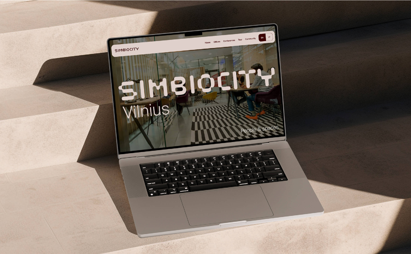
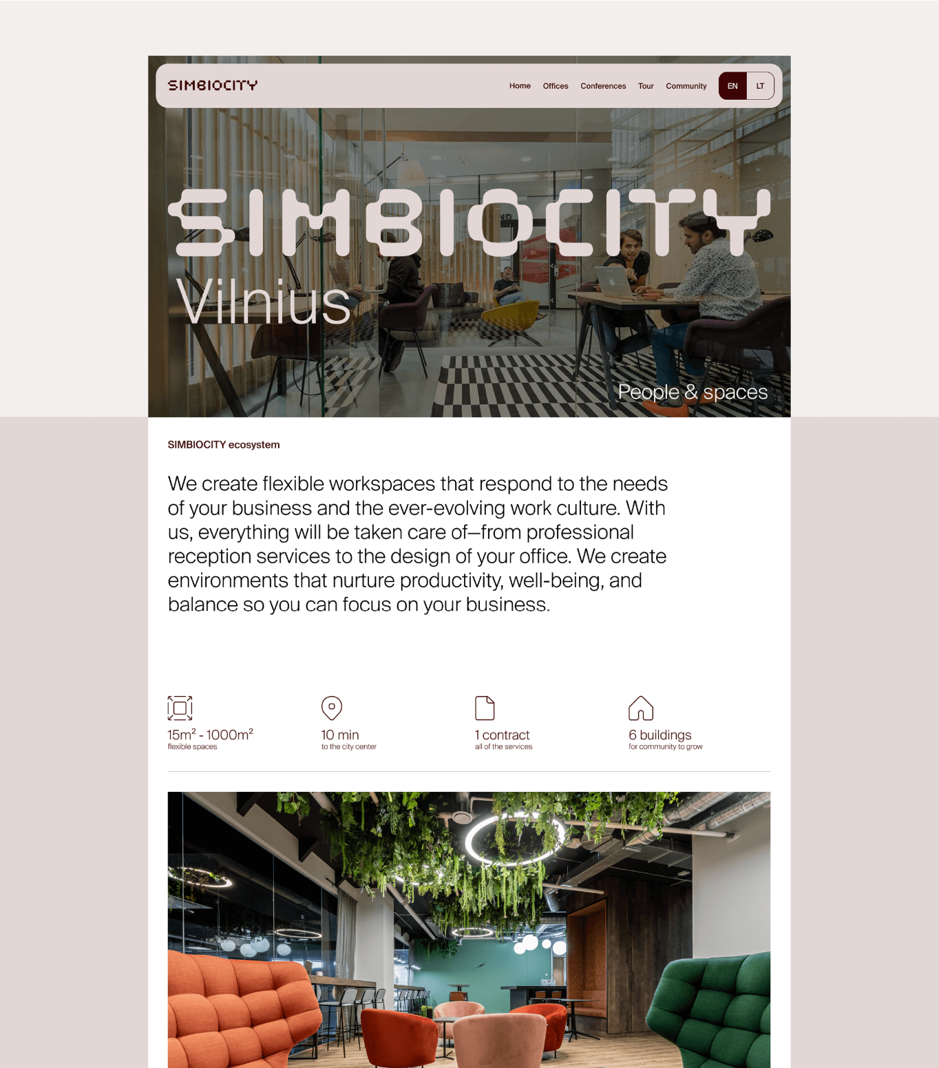
Web design
The web design not only reflects the visual identity but also captures the essence of shaping a unique work experience. To achieve this, a balance of boldness and subtlety was used as the guiding principle throughout the development process.