Lietuvos Krepšinis
- Lauryna Gružaitė
- Emilija Stulgytė
- Deividas Juozulynas
- Jonas Liugaila
- Paulius Budrikis
- Regina Terekė
- Mykolas Saulytis
- Vidmantas Girskas
- Miglė Lapienytė
- Simon Gimelstein – (Pete&Wolf)
Lithuania Basketball
Naming, Sonic Branding, Brand Visual Systems, Digital environments, Brand positioning, Brand identity
2025
The Challenge
How can we craft a visual identity powerful enough to unite and represent Lithuania’s entire basketball culture under one umbrella?
The Context of the Challenge
Lithuanian basketball culture has shifted toward a system dominated by private clubs. At the same time, the broader basketball ecosystem—from youth programs to the national team—lacks an integrated visual identity and a unified value proposition.

Quantitative research revealed the viewpoints of various stakeholders, giving us a more objective understanding than relying solely on leadership insights.
Interactive workshops with selected stakeholders provided a deeper understanding of the challenges and potential pathways forward.
The Insight
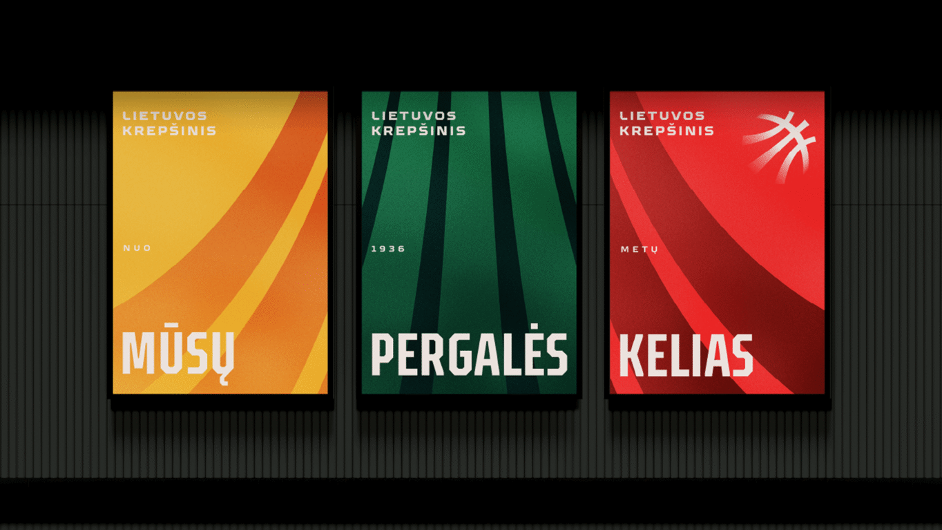
To create a visual narrative that resonates across diverse cultures, the storyline must focus on the journey of growth rather than the end results. This historical narrative celebrates the path itself—the effort, progress, and dedication that ultimately lead to victories. Highlighting this narrative through distinct visual elements is essential for establishing shared value across the network of organizations and the people within them.
Logotype
The essence of the logotype is rooted in the idea of ‘The Ambition to Win’. This ambition is expressed through the directional lines that symbolize growth, basketball, and an evolution of the previous logotype’s structure. The transformation of the logo itself represents a path of continuous growth.

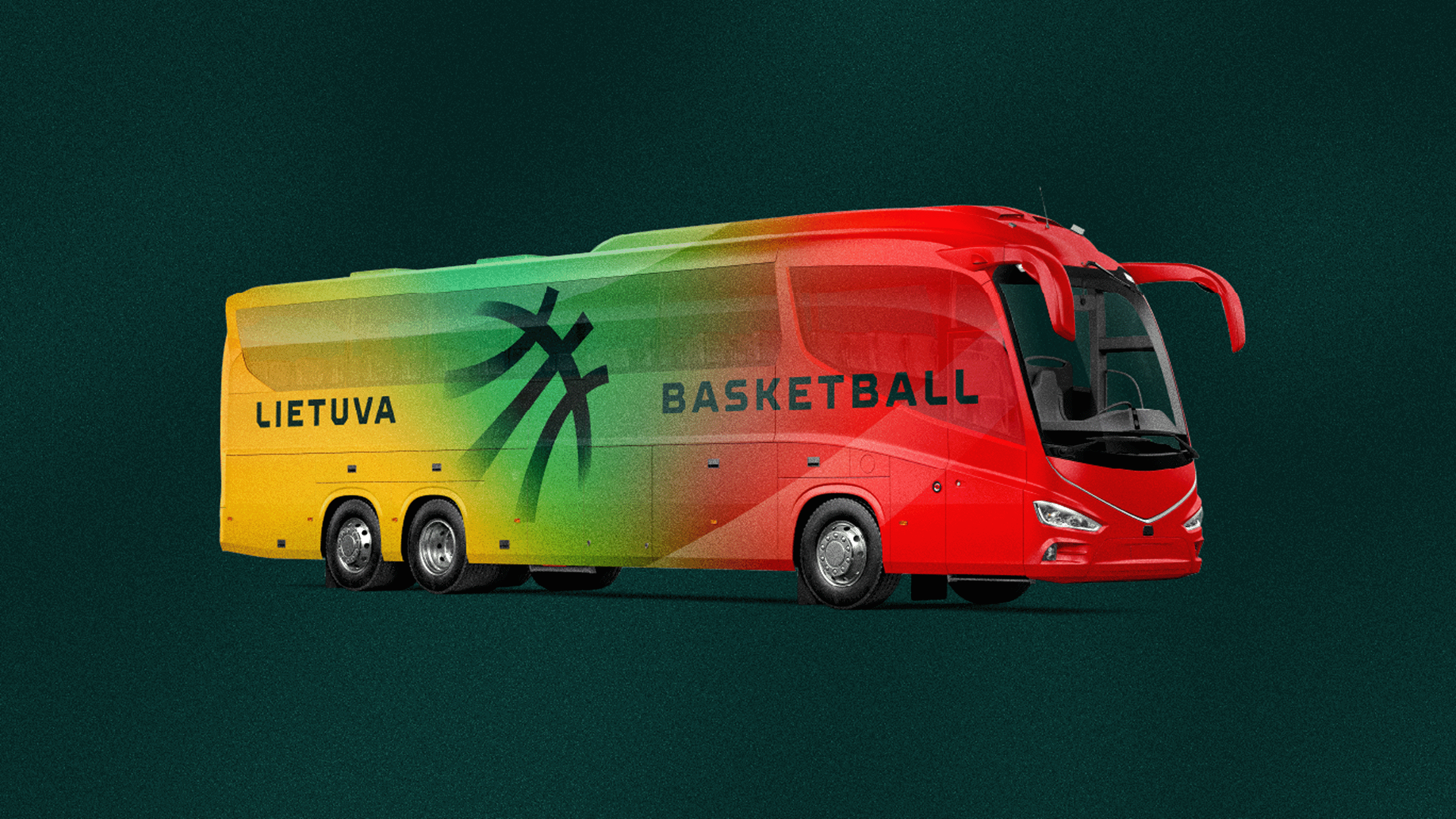
Visual Identity
The visual identity combines the iconic colors of the legendary T-shirt—recognized around the world—with growth-oriented arrow motifs. The selected photos and stories highlight diverse moments of dedication, all aligning into a single, unified narrative of growth.


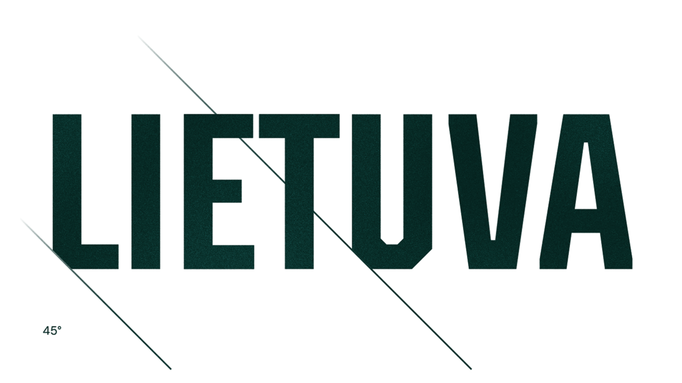
Typography
Typography plays an important role in a sports identity, so the typeface was designed to feel distinctive and instantly recognizable. Its sharp, athletic, and bold aesthetic reflects the dynamism of basketball. The 45-degree cuts create a unique rhythm and define a consistent brand code.


The Change to the Context
Lithuanian basketball culture now has a unified visual story that connects different stakeholders, demonstrating that all efforts and stories are part of a single community and shared journey of success. The visual language reinforces this value across multiple touchpoints.